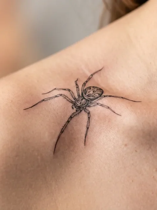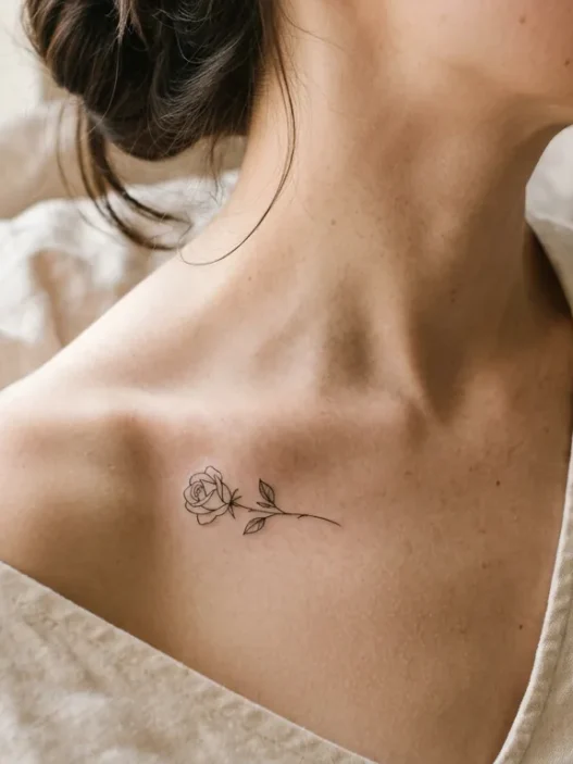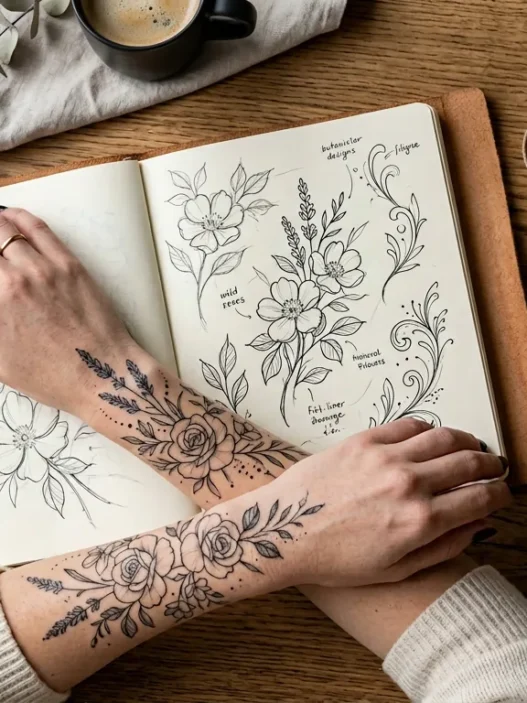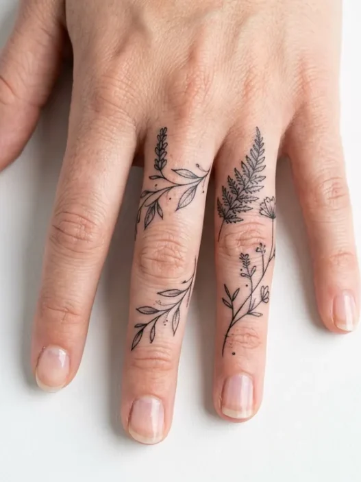






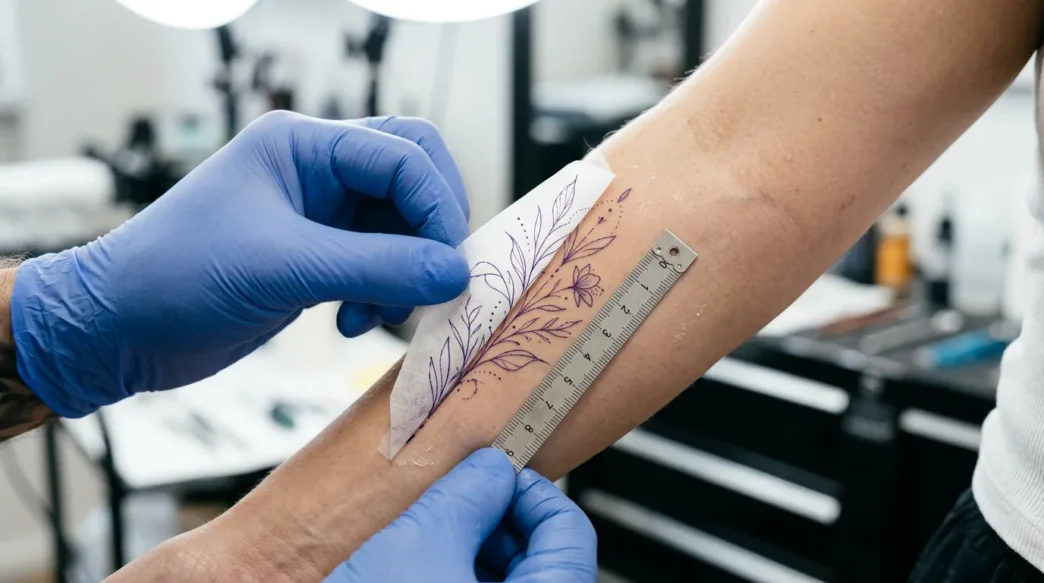
I spent three weeks agonising over where to put my botanical fine-line piece before my artist finally said, “The placement decision is half the tattoo.” She was right — and I wish someone had walked me through the actual logic earlier. Elegant tattoos, specifically, are unforgiving about location. They rely on clean negative space, graceful proportions, and a surface that won’t betray them over time. So I put together everything I’ve learned — from my own experience and from hours of consultations — into this placement deep-dive.
Everything You Need to Decide Before You Book
- What You’ll Need Before This Decision
- How the Design’s Proportions Dictate Placement
- Skin Movement and Ageing Over Decades
- Visibility — What You’ll See, What Others Will
- The Spots Worth Avoiding for This Design
- Step 1: Map Your Design’s Dimensions
- Step 2: Assess Your Skin’s Behaviour at Each Site
- Step 3: Test Your Visibility Threshold
- Step 4: Make the Final Call
- Questions I Get About This
What You’ll Need Before This Decision
This isn’t a tools-and-ink list — placement decisions happen before you ever sit in a chair. Here’s what you actually need to gather before working through this guide:
- A printed or digital reference of your design (or a rough sketch of the proportions)
- A fabric tape measure — for measuring actual skin real estate at candidate spots
- A mirror, ideally full-length, so you can observe how each site looks at rest and in motion
- A few printouts of the design at scale (your artist can do this, or a home printer works fine)
- Basic knowledge of your lifestyle — desk job vs. physical work, sun exposure, dress code at work
- Honest answers about your pain tolerance by body zone (the internet has decent maps for this)
- A shortlist of 2–3 placement candidates — spine, forearm, calf, sternum, upper arm, ribcage, whatever’s calling to you
That’s genuinely it. The rest is decision-making, and that’s what the steps below will walk you through systematically.
How the Design’s Proportions Dictate Placement
This is the part most people skip, and it’s the part that haunts them later. Elegant tattoos — the fine-line botanicals, the single-needle portraits, the delicate geometric formations — are fundamentally about ratio. They need a canvas that respects their shape. A long, vertical design forced onto a short, horizontal forearm will always feel cramped. And a small, circular medallion centred on a wide back panel will look lost.
Vertical designs love the spine, the inner arm, the shin, and the sternum. These are naturally elongated planes. A trailing floral vine or a script quote with descenders breathes on a spine in a way it simply cannot on a calf’s curved, wide surface.
Horizontal or wide designs — a bird in flight, a branch with lateral spread, a crescent — belong on the collarbone, the upper back between shoulder blades, or the forearm’s broad face. I’ve seen so many beautiful branch designs stuffed onto a spine and it always reads as a compromise.
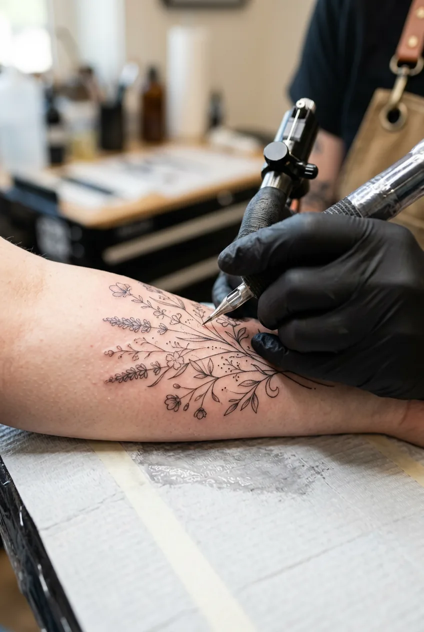
Compact, circular, or symmetrical designs — mandalas, single flowers, coin-shaped motifs — work wonderfully in naturally framed spots: the back of the neck, the inner wrist, the ankle, the nape. These spots act like a picture frame. The border of the body part gives the design a natural edge.
When I look at why elegant tattoos outperform simpler designs over time, it almost always comes down to a perfect fit between design geometry and canvas shape. Worth thinking about seriously before you commit.
One practical test: take your scaled printout, fold it to approximate the design footprint, and hold it against candidate spots in a mirror. Does it sit naturally? Does the negative space feel intentional, or does it just feel like wasted skin? Trust that gut read — it’s usually right.
Skin Movement and Ageing Over Decades
Here’s the honest conversation most people wish they’d had before booking. Every placement ages differently — not just because of UV or time, but because of movement. Skin that stretches, compresses, and folds regularly will distort a fine-line elegant tattoo far faster than skin that mostly stays put.
The inner elbow and the back of the knee are two of the worst offenders. They flex hundreds of times a day. Fine lines in those joints blur and spread within five to eight years, sometimes sooner. I’ve seen pristine-looking floral tattoos on inner elbows start to look like soft watercolour within a decade — which might actually suit some styles, but if you want a refined, sharp elegant design, that’s not what you’re after.
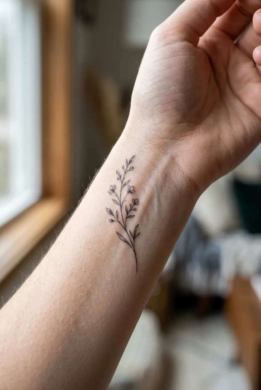
The forearm, by contrast, is one of the most stable surfaces on the body. It gets sun (which matters for fading) but it doesn’t flex and compress at the skin level the way joint-adjacent areas do. The outer forearm ages reliably well for fine-line work. The inner forearm is slightly more prone to spread over time due to the softer skin, but it’s still a solid choice.
The spine ages beautifully — with caveats. Significant weight changes affect the lower back more than the upper. If you’re placing a long spine tattoo, the upper third (between and just below the shoulder blades) is the most stable zone. The lumbar region shifts more with body changes and pregnancy.
Calves are actually underrated for longevity. The gastrocnemius muscle beneath gives the skin structure, movement there is mostly rotational rather than compressive, and the surface doesn’t stretch dramatically with normal weight fluctuation. How fine-line work ages over time is genuinely worth reading before you decide — the difference between placements is striking.
Mistake I made: I chose my inner upper arm for a delicate single-needle botanical because I loved the privacy of it. What I didn’t account for is that the inner upper arm — especially near the armpit — is consistently creased, compressed, and sweaty during daily life. Within two years my artist was recommending a touch-up on lines that had softened noticeably. If I did it again, I’d go outer upper arm without hesitation.
If longevity is a priority (and for an elegant tattoo, it should be), the hierarchy roughly goes: outer forearm ≈ outer calf ≈ upper back > spine > inner forearm > ankle > inner arm > joints. Anything over or immediately adjacent to a major joint is high-risk for single-needle or hairline work.
Visibility — What You’ll See, What Others Will
This is more personal than any other factor, and it’s the one people are most tempted to answer based on what they think they should want rather than what they actually want. So let’s be honest about it.
There are two visibility questions, and they’re not the same. One: can you see it easily in daily life? Two: is it visible to others in your normal professional and social context?
Some people want a tattoo that’s primarily for themselves — a private anchor, a personal reminder, something they catch a glimpse of when they dress in the morning. For this, the inner wrist, the collarbone, the ribcage, and the upper thigh are beautiful. You see them in intimate moments. Others mostly won’t, unless you show them.
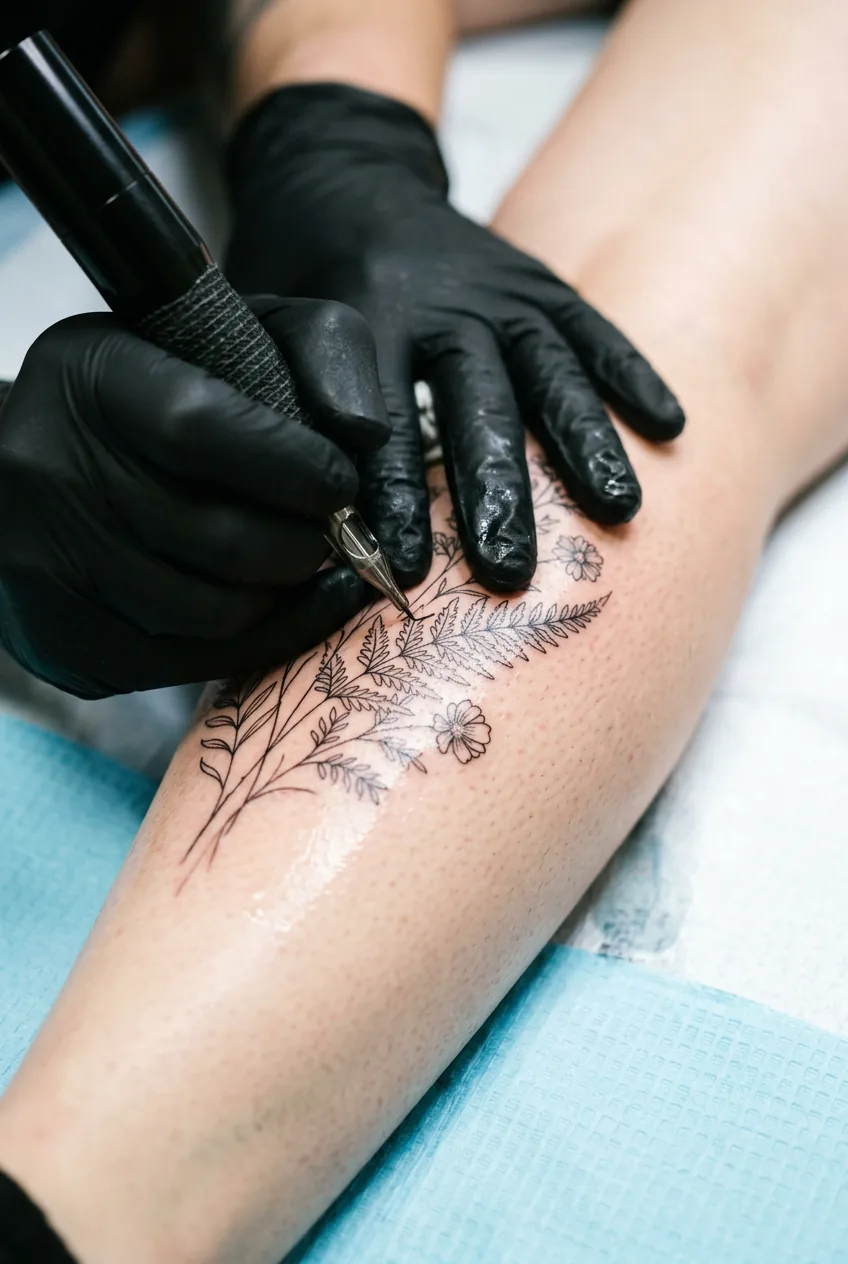
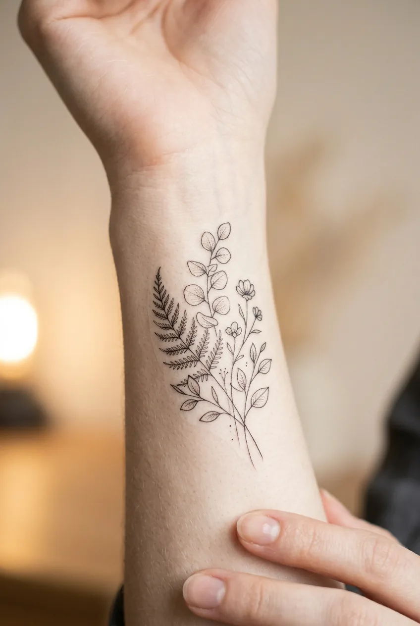
Look at her wrist in that photo — the way the design sits just below the pulse point, visible every time she raises her hand. That’s the kind of placement that works as a daily reminder without broadcasting to a boardroom. It’s a very specific sweet spot.
Other people want their tattoo to be part of how they present themselves — visible in a blazer sleeve, peeking from a neckline, wrapping a calf in a summer dress. That’s equally valid. But it does mean thinking practically about your work environment. I know women in conservative professional settings who chose spine or ribcage placements for pieces they genuinely love, and they’ve never had a single workplace conversation about them. That freedom matters to some people enormously.
The forearm is perhaps the most discussed spot for visibility decisions. It’s visible in short sleeves, hidden in long ones. For most people in most jobs in 2026, a forearm elegant tattoo is completely unremarkable. But if your specific environment skews traditional, it’s still worth a moment’s thought. workplace tattoo visibility is a useful resource if you’re genuinely unsure.
Also worth considering: the ankle and foot. Highly visible in sandals and summer dresses, completely invisible in boots and work trousers. For women who want seasonal visibility — a piece that lives in summer and hibernates in winter — this placement offers a lovely natural rhythm.
The Spots Worth Avoiding for This Design
Not every placement is right for an elegant, refined tattoo — and part of being a committed planner is hearing the honest version of this.
The hands and fingers are genuinely problematic for fine-line elegant work. The skin is thin, the movement is constant, and the ink simply does not hold the way it does elsewhere. Single-needle hairline work on fingers typically needs touch-ups within twelve months. Your artist might do it, but the best ones will tell you the same thing I just did.
The foot’s top surface is similar — high friction from footwear, poor ink retention, and awkward healing. The ankle itself is far better than the foot proper.
The inner bicep close to the armpit — as I mentioned in my own mistake — is problematic for fine detail work. It’s a spot where skin folds and compresses during normal daily movement, and delicate work suffers disproportionately.
The back of the knee and inner elbow, as mentioned above. Worth repeating because people underestimate them constantly.
The lower abdomen and hip if you think you might want children in the future, or if significant body changes are likely. I’m not saying don’t do it — I’m saying go in with open eyes. Skin in that zone can shift significantly, and fine-line work there won’t always survive a pregnancy intact.
There’s a whole conversation to be had about style and placement compatibility, which picking the right style for a small elegant tattoo covers really well — specifically the section on how fine-line work demands more stable placement than bold or blackwork equivalents.
Step 1: Map Your Design’s Dimensions
Now we get sequential. Everything above is context — this is where you actually make the decision, methodically, so you don’t second-guess yourself in the consultation chair.
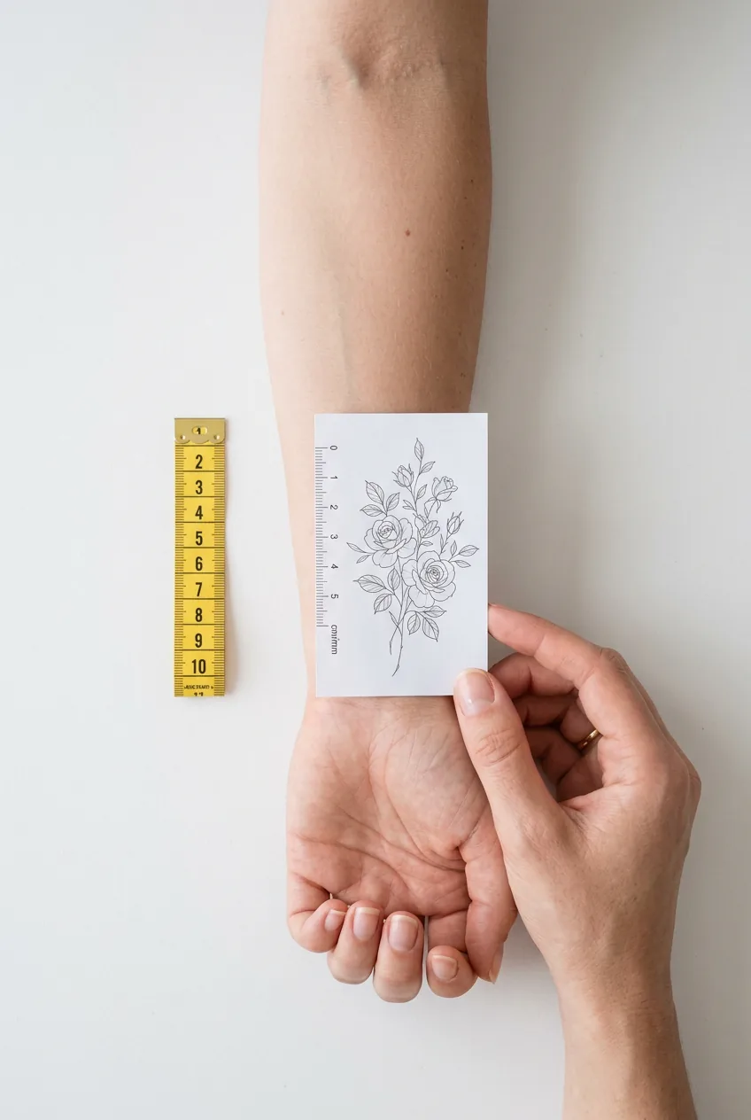
Take your design reference and measure its proportions. Not the image file size — the actual intended tattoo size. Ask your artist (or decide yourself) what the final dimensions will be in centimetres or inches. Write them down. Height × width.
Then take your tape measure to your top three candidate placements. Measure the usable skin real estate at each location. A forearm might offer you 15–20cm of length and 6–8cm of width. A spine might give you 25–30cm vertically but only 5–6cm horizontally before the muscles curve away. A calf might offer a wide, slightly curved canvas of 12 × 10cm.
Compare. Does your design’s aspect ratio match any of those canvases naturally? You’re not looking for a tight fit — you want the design to sit comfortably within the space with room to breathe on all sides. A rough rule I use: leave at least 1–1.5cm of clear skin on every edge. Less than that and the piece will feel crowded.
Eliminate any placement that fails this test. You might go from three candidates to one immediately. That’s fine — that’s the test working.
Step 2: Assess Your Skin’s Behaviour at Each Site
With your shortlist narrowed by proportions, now you evaluate longevity at each remaining site. Go back to the skin movement section above and apply it specifically to your candidates.
For each remaining placement, ask yourself three questions. First: is it near a major joint? Second: does this area of my body change significantly with weight fluctuation? Third: is this spot regularly compressed, folded, or rubbed by clothing?
Score each placement 1–3 on each question (1 = no concern, 3 = serious concern). Add the scores. The placement with the lowest total is your longevity winner. This isn’t scientific, but it forces you to think concretely rather than just vaguely feeling that the spine is “probably fine.”
Also factor in your own skin. If you have particularly stretchy, elastic skin, fine-line work may diffuse faster than average regardless of placement. If you tend toward very dry skin, you’ll need to be more diligent about moisturising post-healing — and some placements (like the shin) are notoriously difficult to keep moisturised consistently. Worth having that conversation with your artist, who can look at your skin and give you a real opinion.
For context on how different fine line tattoos hold up across different skin types and placements, the gallery there is genuinely useful — you can see healed work across various body zones.
Step 3: Test Your Visibility Threshold
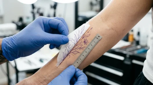
Before your final call, do a real-world visibility test. Take that printed scale reference (or even just a sticker of similar size) and stick it — or hold it — at each remaining candidate placement. Then go about a typical day. Or at least a couple of hours.
How often do you notice it? Does it feel exciting every time, or does it start to feel like it’s always in your eyeline in a way that’s slightly too much? Does it disappear completely under your usual clothes, and does that feel like a relief or a disappointment?
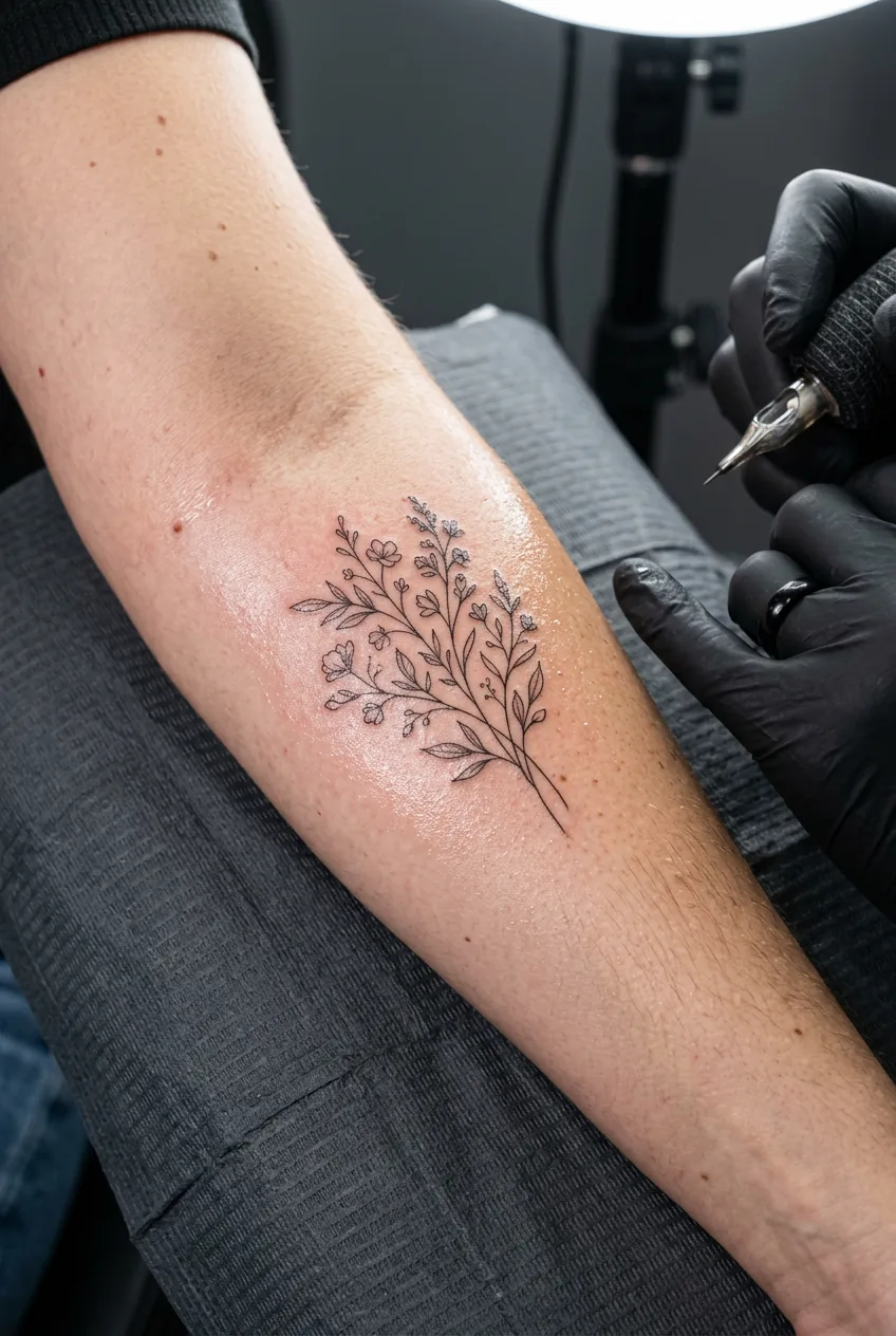
I did this with a strip of tape on my forearm and on my spine over two days. The forearm felt alive — I kept catching it in meetings and feeling a little private thrill. The spine felt invisible to me, which I thought I’d love, but actually I found a bit deflating. That told me something real about what I wanted from the tattoo that no amount of mental deliberation had surfaced.
Also use this step to road-test the professional context. Wear your work outfit. Does the placement show or hide as you’d want? Put on a favourite dress. Does it appear at the neckline, hemline, sleeve? lifestyle tattoo placement tips addresses this from a practical angle if you want a second opinion beyond my experience.
There’s also something to be said for the minimalist tattoo ethos here — placement is almost more important than design for pieces that rely on restraint. A minimalist elegant tattoo in the wrong spot just looks like something got left out. In the right spot, it looks intentional and considered.
Step 4: Make the Final Call
You’ve measured, and you’ve scored for longevity. You’ve lived with it for a day. Now you make the call — and you make it with confidence, because you’ve actually done the work.
Write down your placement choice with one sentence explaining why. I’m serious about this. Write it down. Something like: “Outer forearm, left arm — proportions fit, ages well, visible in summer but coverable, and I loved noticing it during my test day.” That sentence will be your anchor if you get cold feet in the consultation. It will also help your artist understand your thinking and tailor the stencil placement accordingly.
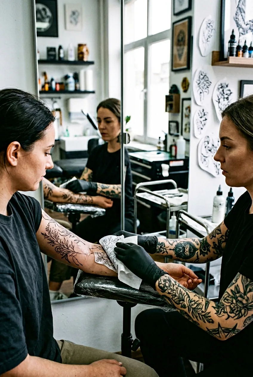
Bring your scaled design reference to the consultation and ask your artist to stencil it at the chosen placement before any decisions are finalised. Stand in front of a mirror. Look at it from three metres away. Look at it up close. Move naturally — raise your arm, flex, rotate. That stencil moment is your last checkpoint, and good artists will give you as much time as you need.
If anything feels wrong — proportionally, positionally, intuitively — say so. Moving a stencil two centimetres higher or rotating it five degrees is trivial at this stage. After the needle, it isn’t.
The difference between a tattoo that you love for life and one you feel ambivalent about often comes down entirely to placement. I’ve seen this play out over and over. Understanding how to choose the right style for a classy tattoo is part of it — but placement is the foundation everything else rests on.
Questions I Get About This
Does the placement affect how painful the tattooing process will be?
Yes, meaningfully. Bony areas (spine, shin, ribs, ankle) tend to hurt more than fleshy ones (outer thigh, calf, outer forearm). That said, pain is subjective and temporary — I’d never choose a placement based on pain avoidance alone, because you end up with a tattoo in a spot you tolerate rather than one you love. Use a pain map as one data point, not a deciding factor.
Can I get a fine-line elegant tattoo on darker skin tones?
Absolutely — but placement becomes even more important, because contrast differs across body zones. The inner arm and inner wrist tend to have lighter pigmentation on deeper skin tones, which can make fine-line work more visible there. An experienced artist who regularly works on darker skin will know exactly how to adjust ink choice and technique by placement. Always ask to see healed work on similar skin tones in your artist’s portfolio.
How long should I wait between deciding and booking?
I’d say at least two weeks after you feel certain. Not because you should doubt yourself, but because a decision that still feels right two weeks later is a solid one. Most reputable fine-line artists have waitlists of several months anyway, so the timeline often resolves itself naturally.
Does placement affect how long healing takes?
It does. Areas that are frequently bent or in contact with clothing take longer and are more prone to scabbing unevenly — inner elbows, backs of knees, the waistband zone, feet. The outer forearm and upper back tend to be the easiest healers. Ask your artist about specific aftercare adjustments for wherever you land.
My final placement ended up being the outer forearm — and a year on, I still catch myself looking at it in a way that makes me feel genuinely glad I took my time with this decision. The design sits exactly right, the proportions breathe, and it’s held beautifully. That’s the result of doing this work before you book, not wishing you had after.