


When I started planning my first sleeve, I thought the hardest part would be choosing the design. Wrong. The real challenge was figuring out which tattoo style would best bring my vision to life. I spent weeks going down rabbit holes, looking at portfolios, and honestly getting more confused by the day.
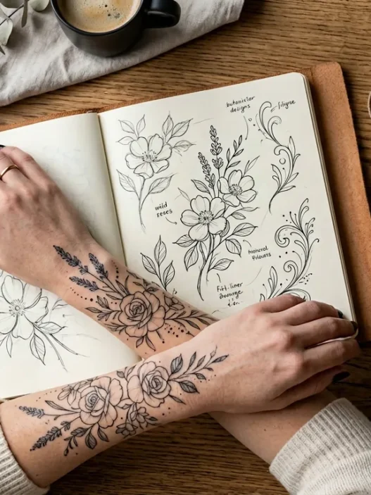
See, I had this gorgeous botanical concept in mind — flowing florals wrapping around my arm. But should I go realistic? Neo-traditional? Watercolor? Each artist I consulted pushed their specialty, which didn’t help. I needed to understand what each style would actually DO to my idea before I could make the right choice.
What Each Style Will Do to Your Sleeve Idea
Let me walk you through the five main styles I considered for sleeve tattoos for women, and what each one actually does to transform your concept.
Realism: Your Design Becomes a Photograph
Realism takes your idea and makes it look like it could exist in real life on your skin. Think portraits, photo-realistic flowers, or animals that look like they’re about to move. My friend Sarah went this route with her rose sleeve — the petals have actual dewdrops that catch light differently depending on how she moves her arm.
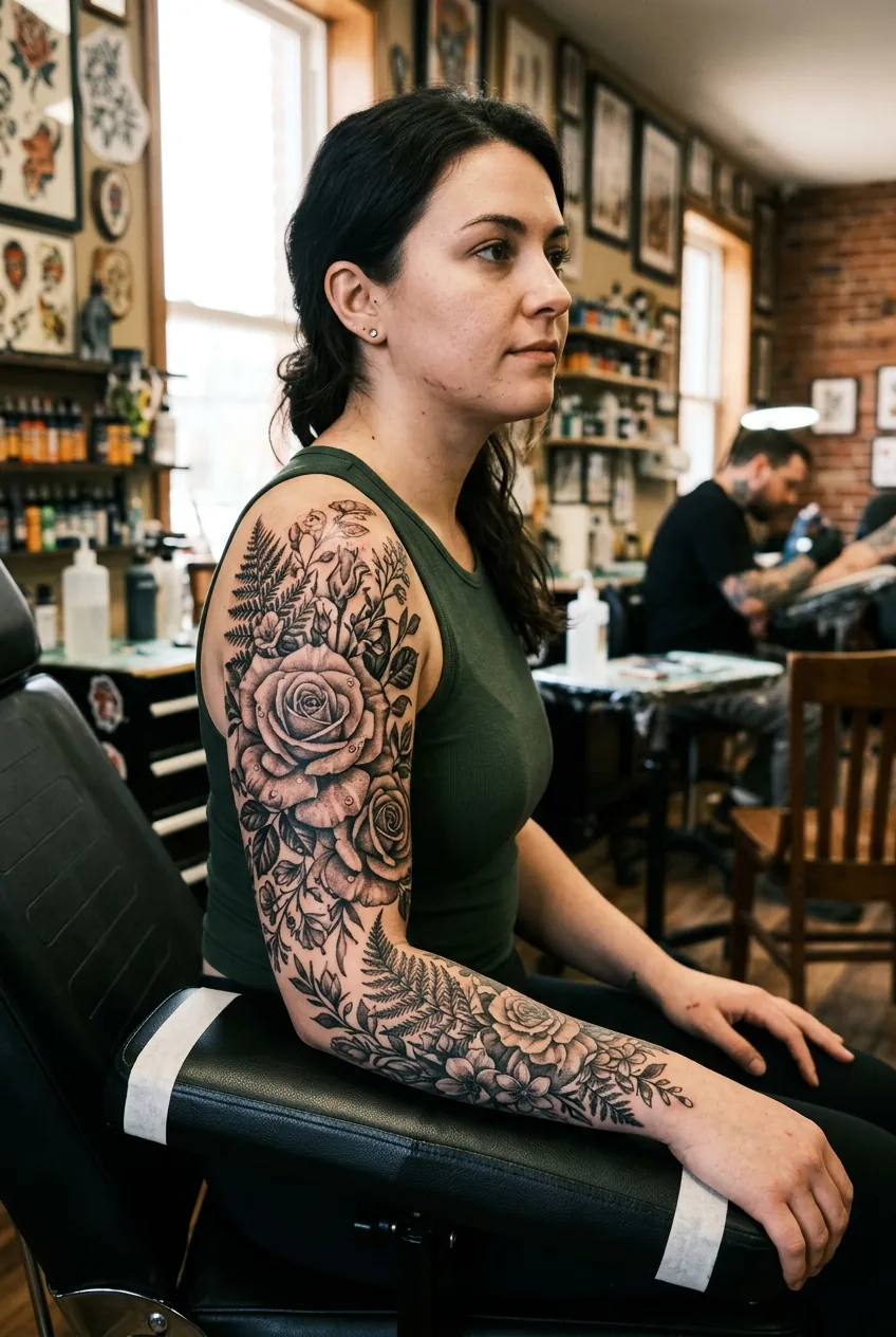
The visual effect is stunning but demanding. Every detail matters. If you’re doing florals, each vein in every leaf will be there. If it’s portraits, every eyelash counts. This style requires the most precision from your artist.
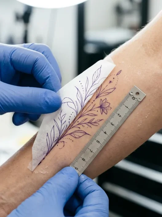
Neo-Traditional: Bold Lines with Modern Flair
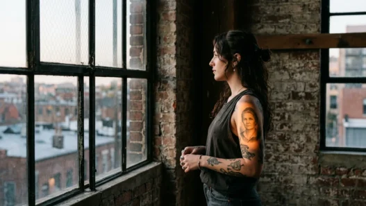
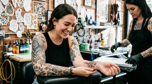
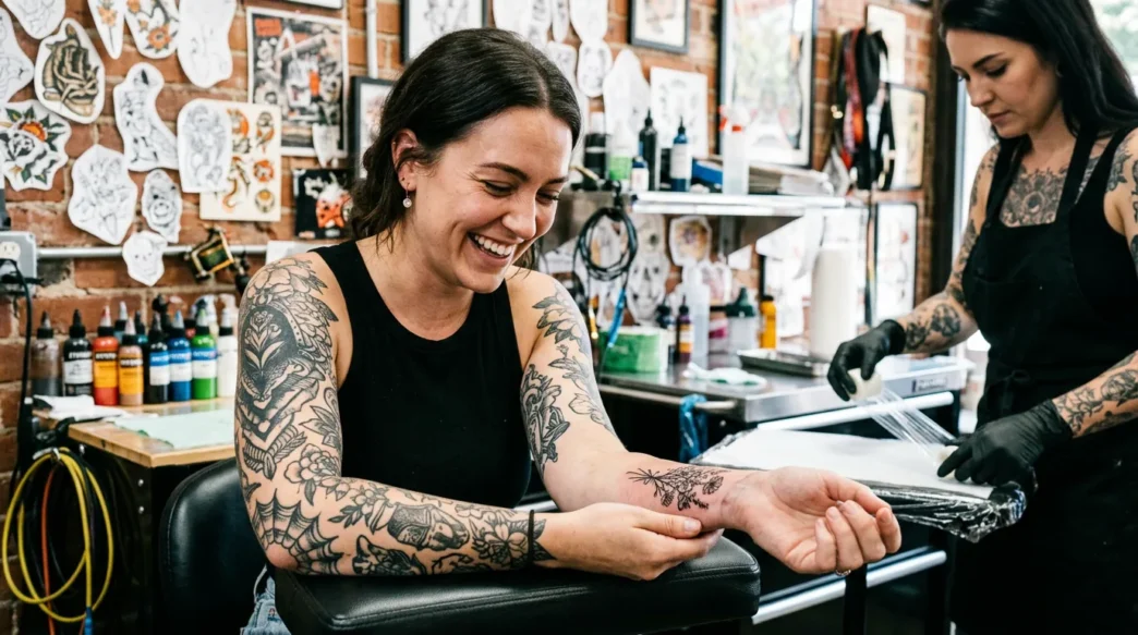
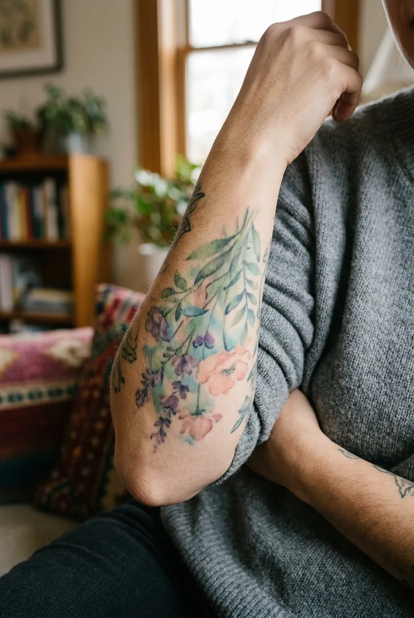
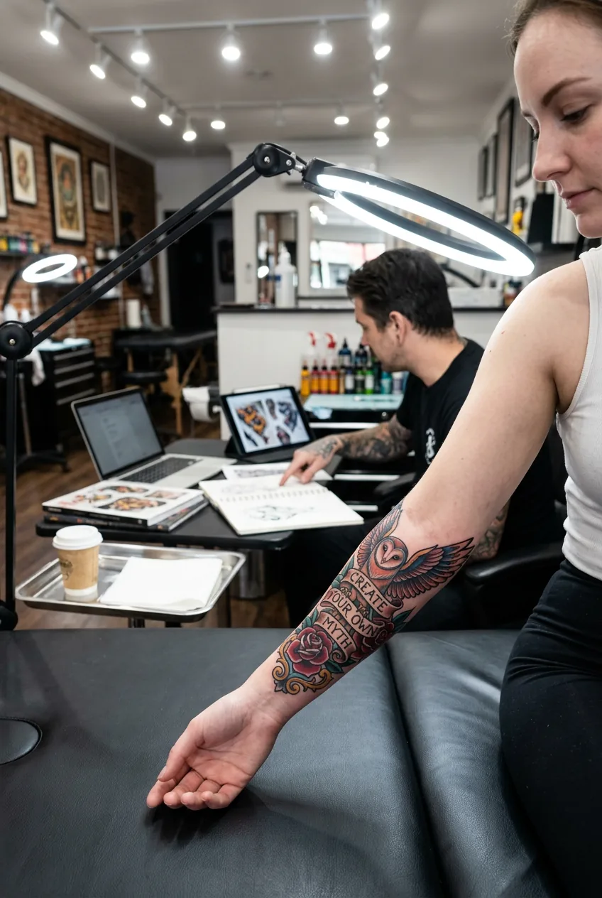
Neo-traditional takes classic tattoo elements — bold outlines, solid fills — and adds contemporary details like gradient shading or unexpected color choices. It’s what I ultimately chose for part of my sleeve because it gave my botanicals structure while keeping them fresh.
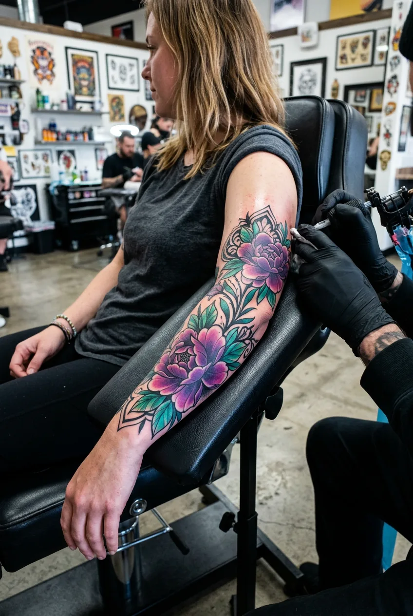
Your design gets that timeless tattoo “look” but with personality. Colors pop more than in traditional work, and artists can play with proportions. My peonies have those classic black outlines but fade into soft purples and greens that wouldn’t exist in old-school traditional work.
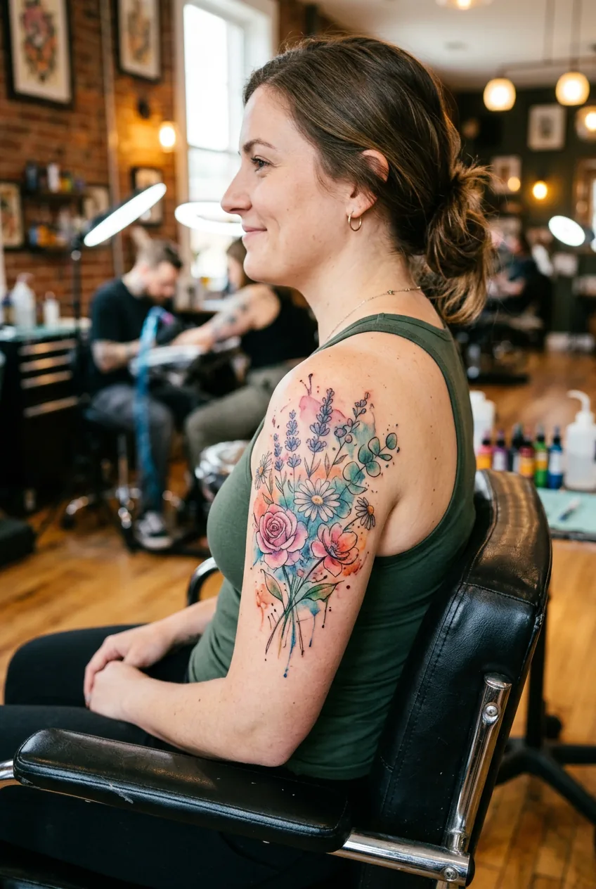
Watercolor: Painterly and Dreamy
Watercolor style makes your sleeve look like someone painted directly on your skin with actual watercolors. Soft edges, color bleeds, and that organic paint-on-paper texture. It’s gorgeous for florals, abstract concepts, or anything meant to feel artistic rather than literal.
But here’s what I learned: watercolor needs either strong black linework as a foundation or an artist who really understands how to make soft edges read clearly on skin. Without structure, these tattoos can look muddy from a distance.
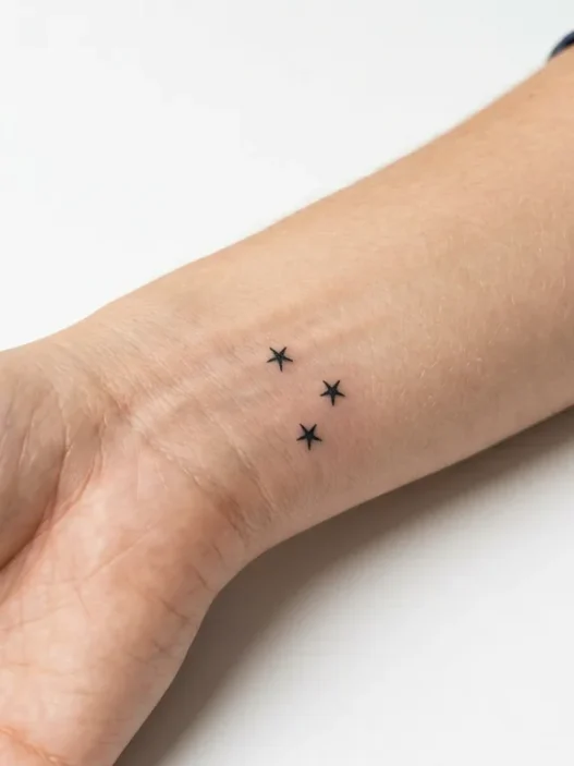
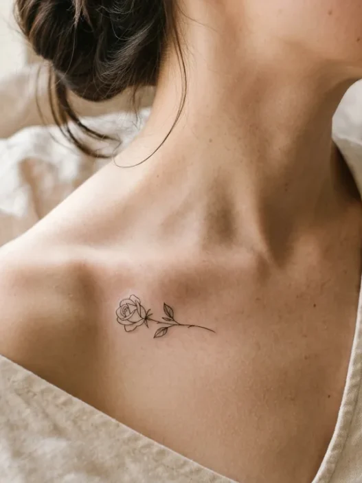
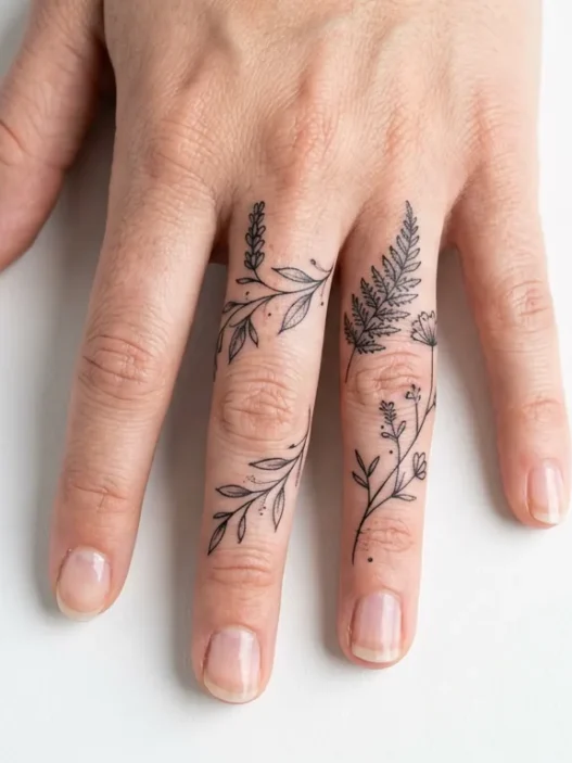
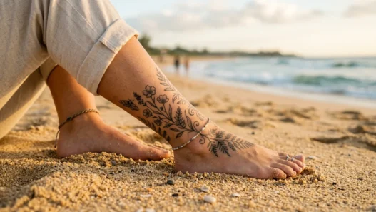
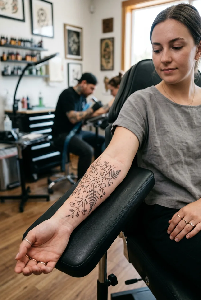
Fine Line: Delicate and Minimalist
Fine line work uses super thin needles to create delicate, intricate designs. Think botanical line drawings, geometric patterns, or script work. It’s having a huge moment right now, especially for hand tattoos for women and extending into sleeves.
Your design becomes elegant and understated. Perfect if you want something that reads as sophisticated rather than bold. I seriously considered this for my entire sleeve before realizing I actually wanted more visual impact.
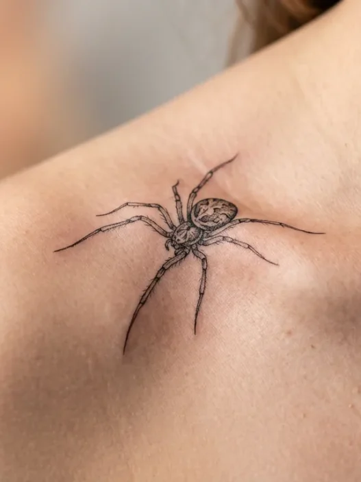
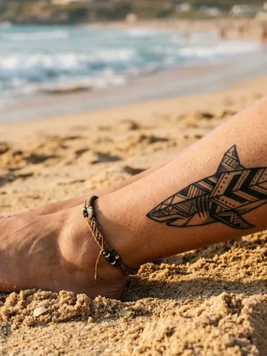
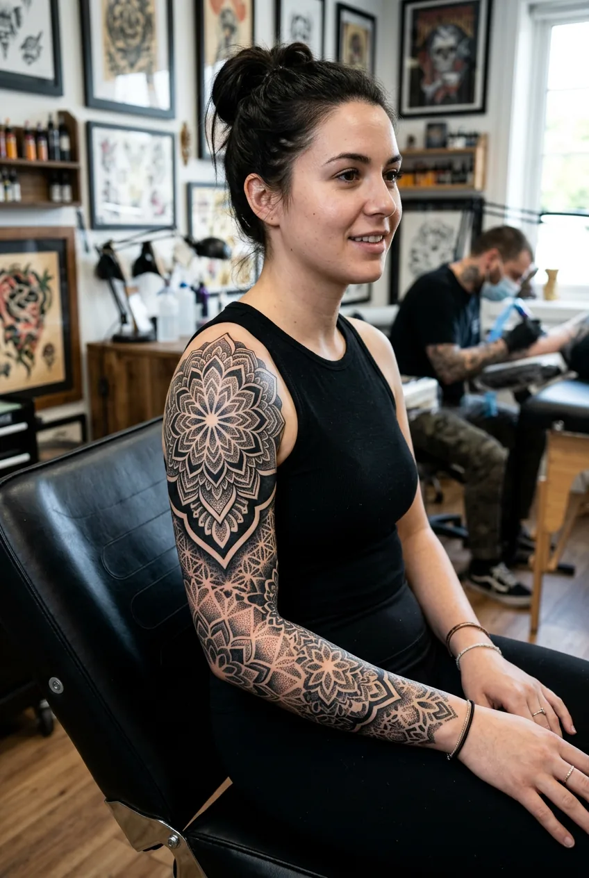
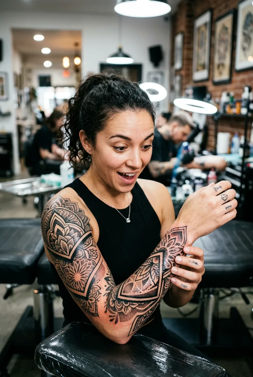
Blackwork: High Contrast Drama
Pure black ink, often using solid fills, heavy shading, or dot work techniques. Your design becomes graphic and striking. Mandala sleeves, ornamental patterns, or bold florals all work beautifully in blackwork.
The visual impact is immediate and powerful. These tattoos photograph incredibly well and never look washed out. Plus, they’re often more affordable since there’s no color mixing involved.
How Aging Differs by Style
This is where things get real. Every tattoo ages, but different styles age very differently. I wish someone had explained this to me upfront.
Realism ages the most noticeably. Those fine details that look incredible when fresh? They soften and blur over time. Skin naturally spreads ink as it ages, so photo-realistic portraits can lose definition after 10-15 years. Not ruined, but definitely changed.
Neo-traditional ages beautifully because those bold outlines hold everything together. Even as colors fade slightly and details soften, the strong structure keeps the tattoo readable. This was a huge factor in my decision.
I almost went full watercolor until my artist showed me photos of watercolor tattoos after five years. The ones without strong linework had gotten muddy and unclear. That completely changed my perspective.
Fine line work can be tricky. Super thin lines might fade or spread over time, especially if your skin type tends to blur tattoos. Some fine line tattoos look incredible after years, others need touch-ups to stay crisp.
Blackwork ages like a champion. Black ink holds better than colors, and bold black designs often look nearly identical decades later. If longevity is your priority, blackwork wins.
Watercolor without linework ages inconsistently. Some fade beautifully into soft, faded art. Others lose definition entirely. It’s the highest risk, highest reward choice.
Your Placement Will Push You One Way
Where you’re putting your sleeve tattoo actually limits which styles will work best. I learned this the hard way during consultations.
Full sleeves have room for any style, but quarter and half sleeves get cramped quickly. Realism needs space to breathe — trying to cram a realistic portrait into a small area just looks cluttered. Fine line work, on the other hand, can create incredible detail even in limited space.
Inner arm placement favors styles that read clearly from multiple angles. Neo-traditional and blackwork work beautifully here because they maintain visual impact whether your arm is at your side or raised. Delicate fine line work can get lost in the inner arm’s natural shadows.
If you’re planning to extend into a spine tattoo later, consider how your sleeve style will connect. Matching styles create cohesion, but dramatically different styles can look intentional too if planned carefully.
Outer arm placement is the most forgiving — almost any style reads well here. This is where you have the most creative freedom.
Cost Differences You Need to Know
Style choice dramatically impacts cost, and not always in obvious ways.
Realism costs the most because it requires the most time and skill. Every tiny detail needs perfect execution. My friend’s realistic floral sleeve took 35 hours across six sessions. That’s serious money.
Neo-traditional falls in the middle. More complex than traditional work but faster than realism. My section took about 12 hours total, spread across three sessions.
Fine line work pricing varies wildly by artist. Some charge premium rates because it’s trendy and technically demanding. Others price it lower because it uses less ink. Research your specific artist’s rates.
Blackwork is often the most affordable per hour because there’s no color mixing or complex shading techniques. But large blackwork pieces still add up quickly due to the coverage area.
Watercolor pricing depends heavily on the artist’s experience level. Master watercolor artists charge premium rates, while less experienced artists might undercharge and deliver subpar results.
Don’t forget touch-up costs. Styles that age less gracefully might need more maintenance over the years.
The Question That Actually Decides It
After all this research and soul-searching, the question that finally made my decision clear was this: “What do I want people to notice first — the technique or the concept?”
If you want people to go “Wow, that looks so real!” or “How did they make it look like paint?” — you want the technique to be the star. Go realism or watercolor.
If you want people to connect with your actual design — the meaning, the imagery, the story you’re telling — then technique should support, not overshadow. Neo-traditional, fine line, or blackwork let your concept shine.
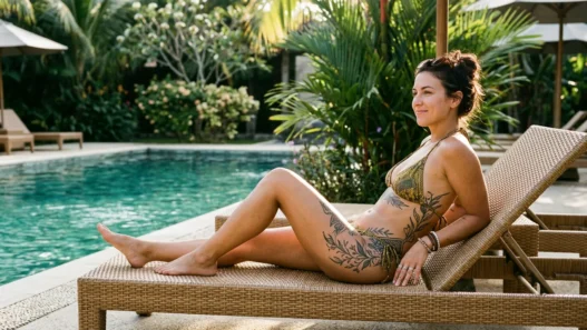
For me, I wanted my botanical story to be the focus. The flowing garden wrapping around my arm mattered more than showcasing a particular technique. Neo-traditional gave me enough visual interest without becoming the main event.
But there’s no wrong answer here. My sister went full realism for her portrait sleeve because she wanted the technical mastery to blow people away. Both approaches are completely valid.
The key is being honest about what you actually want from your sleeve. Questions to ask during consultations can help you get clarity, but ultimately this decision comes from your gut.
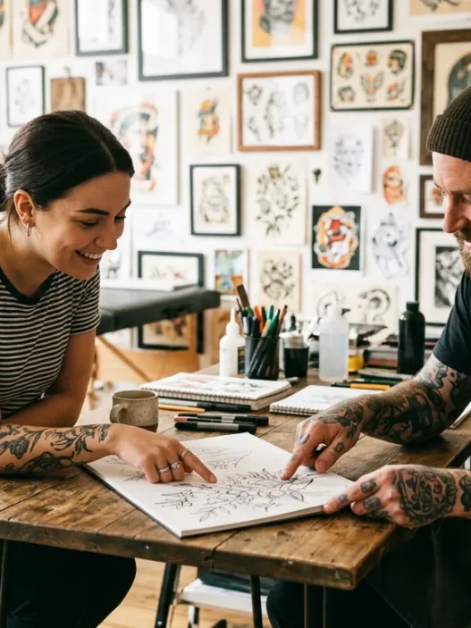
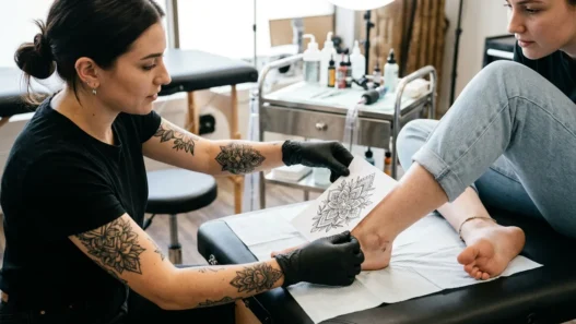
See the Decision Process in Action
Questions I Always Get About Style Choices
Can you mix styles in one sleeve?
Absolutely, but it requires careful planning. I have neo-traditional flowers with fine line stems and some realistic shading details. The key is having one dominant style with others as accents, not trying to make them equal partners.
Which style is best for first-time sleeve clients?
Neo-traditional or blackwork. Both age well, read clearly, and give you room for additions later if needed. They’re also easier for artists to execute consistently across multiple sessions.
How do I know if my artist can handle the style I want?
Look at their portfolio, but specifically look for healed photos of work that’s at least a year old. Fresh tattoos can hide technique problems that show up after healing. Also ask to see examples in your exact style — don’t assume versatility.
Should placement size influence my style choice?
Yes, definitely. Intricate realism needs space to work properly, while fine line and blackwork can create impact in smaller areas. Match your style ambitions to your actual canvas size.
Choosing the right style transformed my entire sleeve experience. Instead of second-guessing every session, I felt confident my artist was bringing my vision to life exactly as intended. That clarity made all the difference.