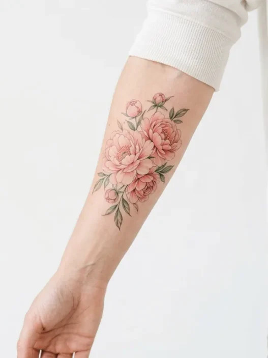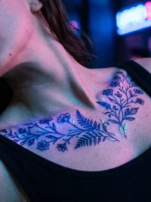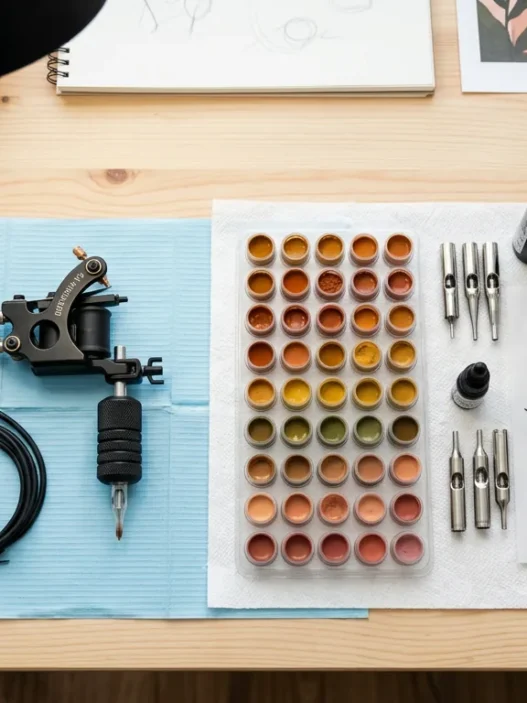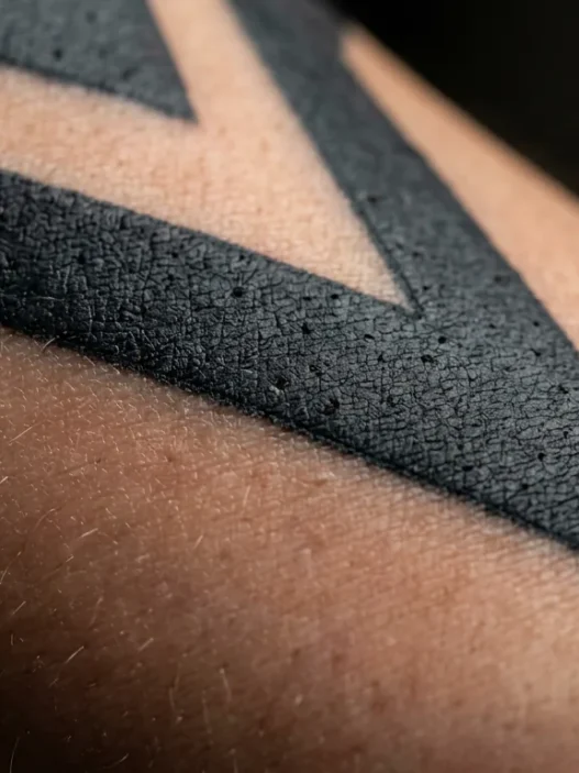




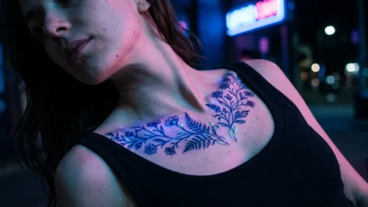

I spent three weeks collecting references before my first large tattoo consultation. I had a folder of 47 images, a Pinterest board that had gotten completely out of hand, and screenshots from six different artists’ Instagram pages. When I finally sat across from my artist and slid my phone over, she looked at the pile and said, very gently, “Which one do you actually love?” That question changed everything about how I approach big tattoo planning now.
The single-reference method isn’t about limiting yourself. It’s about clarity — and clarity is the only currency that matters in a tattoo brief.
Your Roadmap for This Guide
Why One Reference Outperforms Ten
There’s a version of tattoo planning that feels very productive — open seventeen tabs, save every image that vaguely excites you, and somehow believe that a large enough volume of inspo will eventually crystallize into a vision. It doesn’t. What you end up with is a collection of contradictions: a hyper-detailed blackwork sleeve next to a soft watercolor botanical, both of which you love individually and which cannot possibly coexist in a single piece.
One reference forces a decision. And that decision, made early, shapes everything downstream — the artist you approach, the placement you choose, the scale that makes sense. When I started treating a single image as the anchor for my brief, my consultations became genuinely productive instead of meandering. My artist could actually respond to something concrete.
This matters even more for large tattoos. A small piece has limited real estate — the reference image’s complexity is naturally constrained by size. But a large tattoo, say a full back piece or a sleeve, has enough surface area to accommodate a lot — which means a vague brief produces a bloated, directionless result. The bigger the canvas, the more a single focused reference protects you. If you’re curious about how scale shifts the whole planning equation, the tattoo size guide here breaks that down in useful detail.
Step 1: Pick the Right Reference Image
Not every image you love is a usable reference. That’s the first uncomfortable truth of this process. I’ve genuinely adored images that were blurry, over-filtered, or showed a tattoo in a style completely outside what my artist works in — and none of those would have helped either of us.
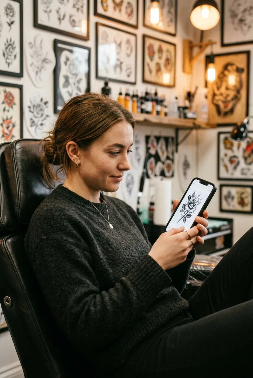
Start by going back through every image you’ve saved and asking one question: does this make me feel something specific, or does it just look cool? Those are different reactions. “Looks cool” is aesthetic appreciation. “Feels specific” means the image is pointing toward something — a mood, a texture, a relationship between negative space and line weight — that you actually want on your skin forever.
Your single reference should be the image you’d show someone if you had to explain your whole tattoo vision in one picture. It’s the one that, if you lost every other saved image, you’d still feel confident walking into a studio with. Find that image. Save it separately. That’s your anchor.
Step 2: Audit What Makes It Actually Usable
Once you have your one image, you need to look at it critically — not emotionally. There are specific qualities that make a reference actually useful in a consultation, and a few that make it nearly useless regardless of how much you love it.
Line clarity. Can you see the actual linework, or is the image so small, filtered, or compressed that the lines are just suggestions? An artist needs to read the structure of the piece. If you can’t see where one element ends and another begins, neither can they.
Style legibility. Is this clearly in a style your chosen artist works in? A realism reference brought to a fine-line specialist isn’t useful — it creates confusion about what you actually want. Learn to identify the style your reference represents. Identifying your tattoo style is worth reading before your consult if you’re still fuzzy on the vocabulary.
Scale honesty. Does the piece in the reference exist at a scale that’s realistic for where you want your tattoo? A full-back mandala reference is unhelpful for a forearm placement. Look at where the reference tattoo actually lives on the body in the image — and be honest about whether that matches your plan.
Palette alignment. If the reference is a rich full-color piece and you’re set on black and grey, you’re not really referencing that image — you’re referencing a version of it that doesn’t exist yet. Either choose a reference that matches your actual palette goals, or be explicit in your brief that you’re referencing composition only, not color.
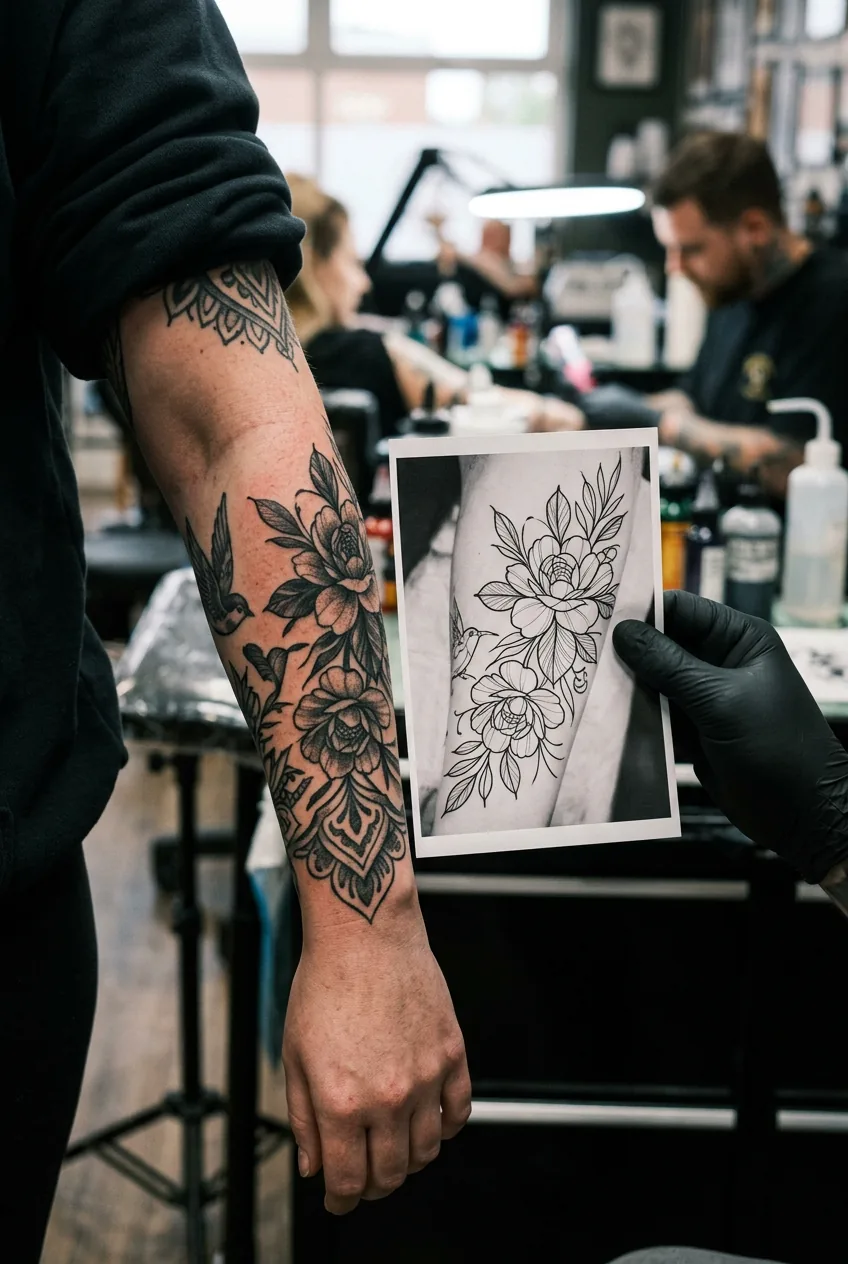
The mistake I made: I brought a reference of a sleeve tattoo I loved, but I never checked what style it was. Turns out it was neo-traditional — and I’d booked with a fine-line specialist. The consultation was polite but essentially useless. We spent half an hour talking around the fact that she couldn’t execute that reference and neither of us wanted to say it outright. Now I identify the style of any reference before I even make an inquiry.
Step 3: Build the Brief Around It
Here’s where the single-reference method does its real work. Instead of trying to synthesize a dozen images into a coherent brief (which almost never works), you write your brief as a response to the one image you’ve chosen.
I structure mine in three sections. First: what I love about this specific reference — not just “everything,” but granular observations. The way the shading wraps the curve of the shoulder. The restraint in the negative space. The weight of the outlines relative to the fill. Second: what I’d change or translate — because a reference is almost never 100% what you want, and articulating the gap is valuable. Third: any elements the reference doesn’t contain but I want to add — and I keep this list short, because the point of this method is discipline.
Write it out. Literally. Not bullet points — sentences. When you can describe what you want in coherent sentences, you understand it. When you can only gesture at a saved image, you don’t yet, and that will show in the consultation.
For large-scale pieces specifically — full back tattoos and sleeve tattoos especially — the brief needs to address flow. How does the piece move across the body? Does it read as one cohesive composition or a series of connected elements? Your reference should be helping you answer that question, not leaving it open.

How a Real Tattoo Brief Comes Together
Step 4: Adjust for Your Skin and Body
Your reference exists on someone else’s body, in someone else’s skin tone, at a specific angle, on a specific person’s anatomy. None of that is your body. This step is about bridging that gap honestly before you walk into the studio.
Skin tone affects everything in execution — contrast, saturation, the viability of very light ink, the way grey washes read at healed state. If your reference was photographed on significantly lighter or darker skin than yours, the palette may need to shift. This isn’t a limitation; it’s just a variable your artist needs to design around. How pigment heals across skin tones is something worth reviewing so you can have an informed conversation about this with your artist rather than leaving it entirely to chance.
Body shape and muscle structure also matter for large pieces. A design that flows beautifully on a narrow, elongated torso will read completely differently on a broader one — and that’s fine, but it requires intentional adaptation. Ask yourself: does the reference’s composition work with the specific body part I’m tattooing, or does it need to be reoriented, stretched, or compressed? Your artist will have opinions on this, but coming in with awareness of the question makes the conversation much more efficient.
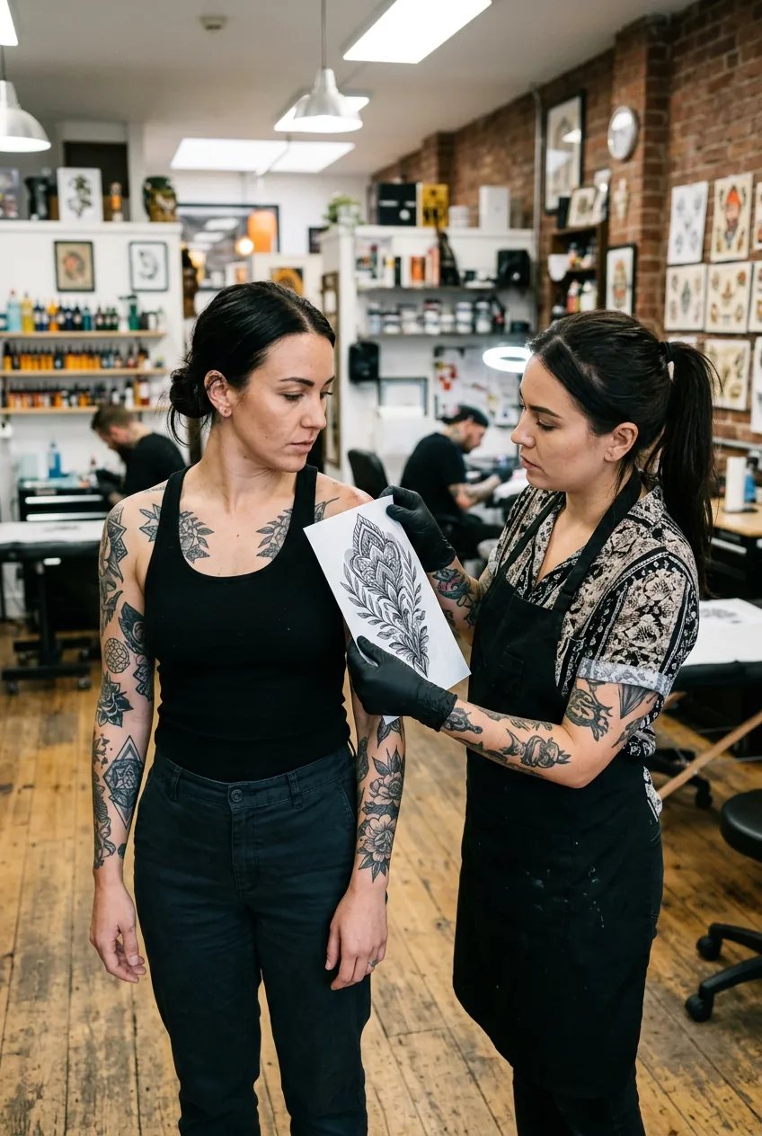
Step 5: Present It to Your Artist
The consultation is where the single-reference method pays off most visibly. Instead of scrolling through a chaotic folder and narrating your own indecision, you show one image and read from your written brief. The shift in dynamic is immediate and significant.
Lead with the reference, then read the brief aloud — yes, actually read it. It sounds awkward but it prevents the conversation from going off-track before you’ve communicated the essentials. Then stop talking and let your artist respond. The response to a clear brief is almost always more useful than any conversation that comes out of a vague one.
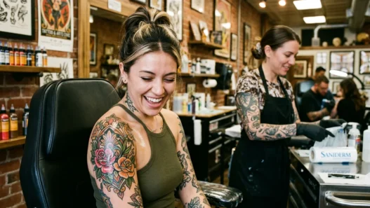
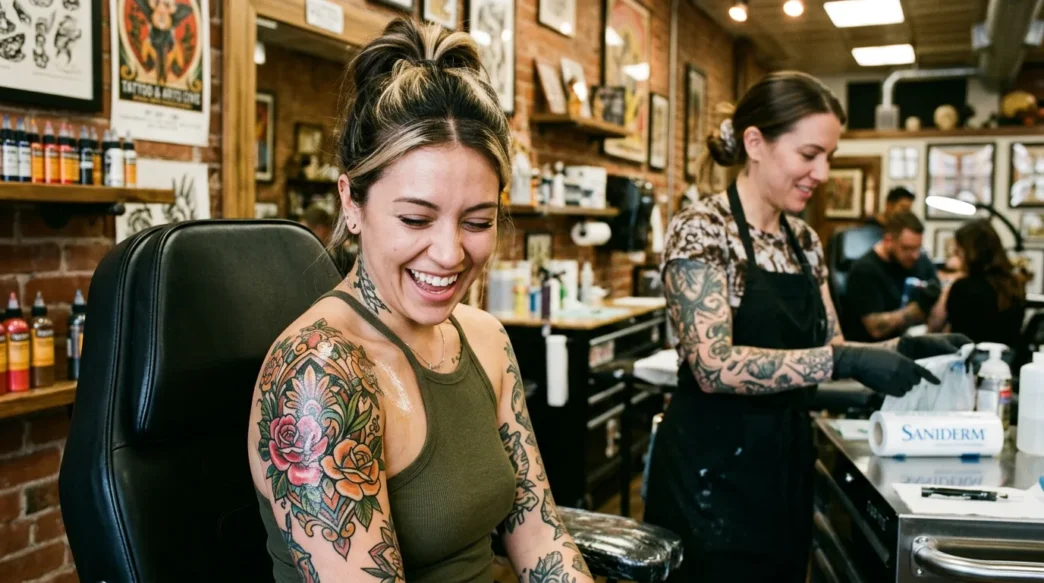
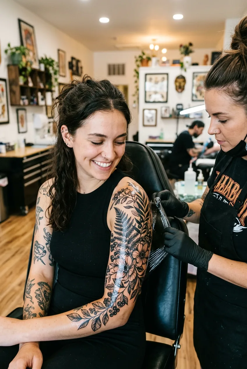
Look at the woman in this photo — she’s in that exact moment of seeing the finished work for the first time, and there’s something in that expression that I think is the whole point of doing this carefully. The emotional result of a tattoo that landed exactly as you imagined is very different from one where you compromised repeatedly because the brief was never clear. Getting to that first feeling requires doing the work in the steps before you ever sit in the chair.

One thing I’ve learned: don’t over-justify your reference. You don’t need to explain why you love it or apologize for having a specific vision. A good artist respects specificity. The ones who push back hardest on clear briefs are often the ones most likely to produce work that doesn’t feel like yours.
What the Artist Is Actually Looking For
When an artist receives a reference, they’re mentally deconstructing it into components they can work with: linework style, shading technique, compositional logic, scale feasibility. A clear reference makes that deconstruction fast. A cluttered brief forces them to do it across multiple images simultaneously, which introduces interpretation error. The single-reference method removes most of that friction before it starts.
Step 6: Let the Artist Respond — Then Refine
This is the step people skip, and it’s the one that makes everything else matter. After presenting your reference and brief, you get feedback — and that feedback is the most valuable information in this entire process. Your job now is to listen without immediately defending your original vision.
Artists will often identify things you couldn’t have anticipated: that a particular element won’t hold at your intended scale, that a certain shading technique looks very different healed versus fresh, that the composition needs to wrap differently to account for how your arm or back actually curves. These aren’t problems with your brief. They’re the consultation doing exactly what it’s supposed to do.
The refinement phase is also where you might introduce one or two secondary references — but only to clarify a specific point the artist raised. Not to reopen the mood-boarding process. If they say “I want to check my understanding of the shading weight you like,” that’s an invitation to show a second image. If they haven’t asked, don’t volunteer a pile of extras. Trust the brief you built.
For very large pieces — a full back tattoo or multi-session sleeve — expect the refinement conversation to happen more than once. Some artists will show you a sketch at a separate appointment before booking the first session. That’s normal and healthy. The brief you built in Step 3 remains the anchor through all of it.
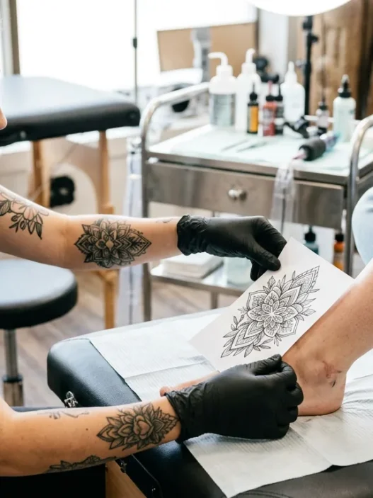
And when the stencil goes on, and it’s positioned just right, and your artist steps back and says “what do you think” — that’s the moment you want to have done this carefully. She’s looking at the shape of something that’s about to be permanent. You want to feel certain, not hopeful.
Questions I Get About This
Can I still use Pinterest for research even if I’m committing to one reference?
Absolutely — Pinterest is great for the discovery phase, before you’ve chosen your anchor image. The problem comes when the mood board replaces the brief rather than feeding into it. Use Pinterest to find your one image, then step away from it. The brief you write afterward should not depend on the board at all.
What if my artist says the reference isn’t achievable?
That’s useful information, not a failure of the method. Find out specifically what isn’t achievable — the scale, the style, the technique — and ask what the closest achievable version looks like. Sometimes the answer is switching artists; sometimes it’s adapting the brief. Either outcome is better than finding out post-tattoo that the reference was never realistic.
Does this method work for smaller tattoos too, or just large ones?
It works at any size, but the payoff is proportional to scale. For a tiny wrist piece, a loose brief is recoverable because the design has limited complexity. For a large tattoo covering significant body real estate, a vague brief multiplies in cost — financially and aesthetically. If you’re curious about how the briefing process differs at smaller scales, the notes on small tattoos here are worth a look for comparison.
How do I know if my chosen reference is actually achievable at large scale?
The honest answer is: you don’t, fully, until your artist tells you. But a few signals help. Fine detail that relies on small-scale execution (micro-lettering, hyper-fine linework) can actually become easier at large scale — or it can fall apart if the artist isn’t experienced with that size. Ask your artist to describe how they’d approach the reference at your intended scale specifically. Their hesitation or confidence will tell you a lot.
My large tattoo — a botanical wrap around my upper arm and shoulder — came out cleaner and more intentional than anything I’d imagined during those chaotic three weeks of mood-boarding. My artist told me afterward that the brief I brought to the second consultation was the clearest she’d received that month. I don’t say that to brag; I say it because it took me one failed consultation and a complete rethink to get there. One image. Three written paragraphs. That was the whole brief. And it was enough.