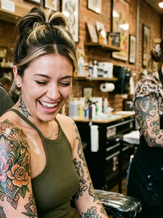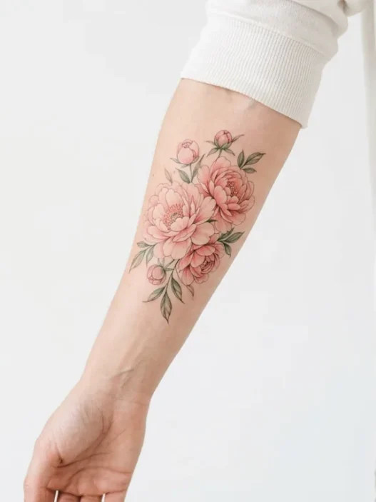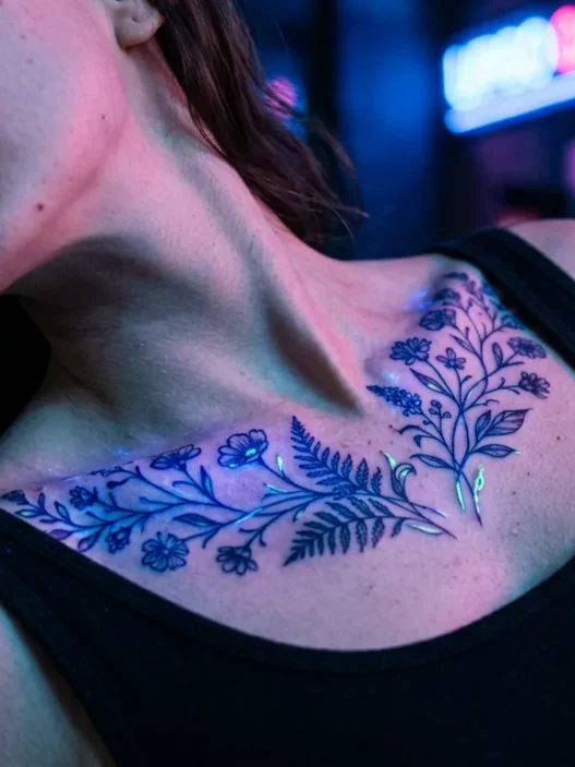



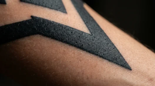
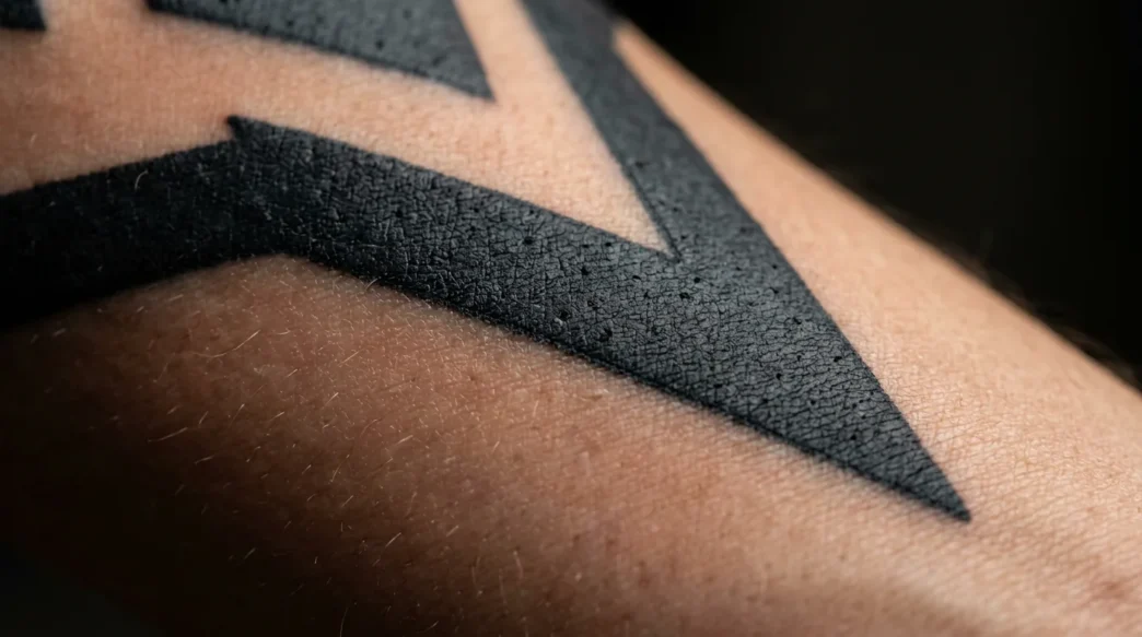
I’ve been thinking about this for a while now — how two tattoos done in the same palette can make you feel completely different things. One sits on a woman’s arm like a whispered secret. Another announces itself across a collarbone with the confidence of someone who never apologizes. Both are black and grey. So what’s actually going on? It’s not magic. It’s colour psychology, contrast ratios, and the quiet grammar of tone. And once you understand it, you’ll never look at a grey wash the same way again.
The Mood Map: What Every Tone Is Doing to You
- Pure Black — Dominance and Edge
- Soft Grey Wash — Dreamlike Quiet
- Deep Navy-Black — Cool Melancholy
- Warm Sepia Tones — Nostalgia and Tenderness
- Heavy Contrast — Drama That Demands Attention
- Micro-Detail Work — Whisper-Light Precision
- White Highlights in Grey Work — Fragile Magic
- Charcoal Mid-Tones — The Workhorse of Longevity
- Near-Black with Negative Space — Restraint That Hits Hard
- Faded Grey — Aged Softness
- Layered Washes — Dimensional Depth
1. Pure Black — Dominance and Edge
Saturated, solid, no apology. When an artist goes in with pure black — no dilution, no grey buffer — the result is a tattoo that owns the room. There’s a reason blackwork tattoos have had such a sustained cultural moment. That ink reads as authority. It’s structural. It pulls the eye and holds it.
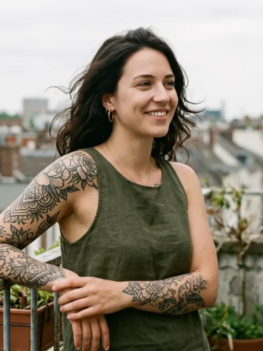
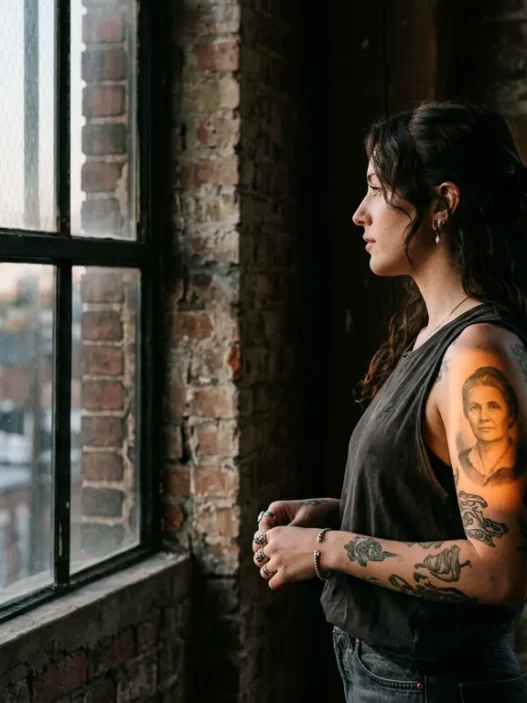
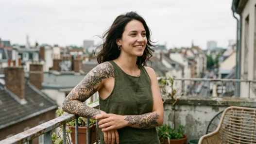
Look at the woman in this photo — see how that saturated line work on her forearm practically vibrates against her skin? That tension is intentional. Pure black creates what I’d call visual weight. It’s not aggressive, exactly, but it is certain of itself. And emotionally, that certainty transfers to the wearer. Women who gravitate toward solid black often tell me they wanted something that felt permanent in spirit, not just in ink.
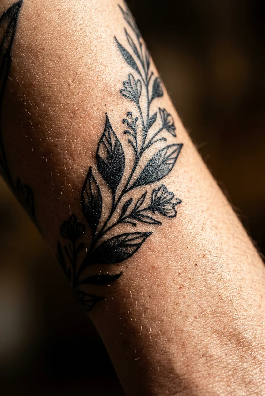
On longevity: pure black is the gold standard. Decades from now, it will have shifted slightly warmer or cooler depending on your skin’s undertone, but it will still be legible. It’s the one colour in the entire tattoo spectrum I never worry about.
2. Soft Grey Wash — Dreamlike Quiet
This is the tone that makes people stop mid-conversation and reach out to touch someone’s arm. Soft grey wash — achieved by heavily diluting black ink with distilled water — creates a watercolour-adjacent softness that feels almost like a memory rather than a mark. It’s impressionistic. Tender, even.
I am completely in love with what skilled artists can do with a single diluted grey. A rose done entirely in pale grey wash doesn’t feel botanical — it feels elegiac. Like pressed flowers in an old book. The emotional register is introspective, quiet, a little melancholy in the best possible way.
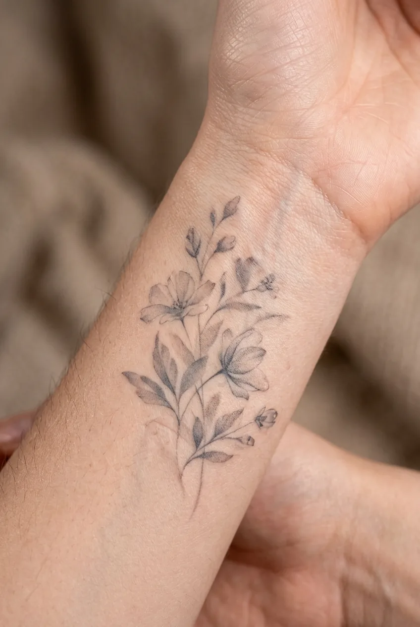
Here’s the honest caveat though: soft grey wash fades. Not catastrophically, but it does migrate and soften further over time, especially in high-movement areas like the wrist or inner elbow. On lighter skin tones it can almost disappear into a ghost of itself within five to seven years without a touch-up. On deeper skin tones, those pale washes may not read clearly at all from the start — and a good artist will tell you that upfront rather than letting you find out the hard way.
3. Deep Navy-Black — Cool Melancholy
Not every black ink is truly black. Some lean cool — almost blue-black, the colour of deep water at night. This is often down to ink brand and formulation, and it creates a very specific emotional effect: cool melancholy. Sophisticated sadness, if you want to be dramatic about it. I do.
This tone works beautifully in portrait work and architectural designs. The cooler cast reads as more cerebral than warm black — more detached, more composed. If you’ve ever seen a black and grey tattoo that felt almost photographic in its stillness, there’s a good chance the artist used a cooler-formulation black.
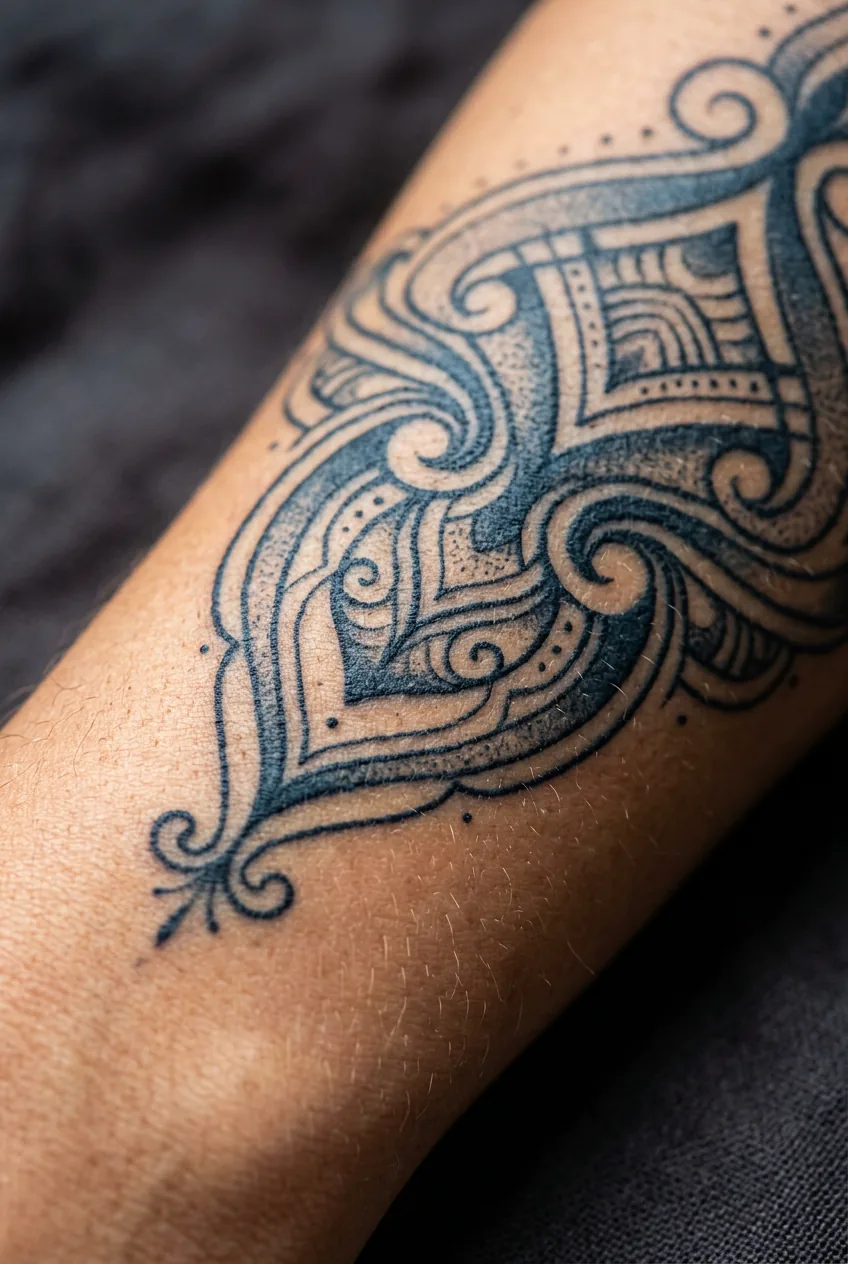
Longevity is strong. Cool blacks tend to shift slightly warmer over time as skin’s natural warm undertones interact with the ink. That said, it’s a slow shift — we’re talking years, not months — and often ends up adding a beautiful depth to the work rather than degrading it.
4. Warm Sepia Tones — Nostalgia and Tenderness
Some artists mix their greys with a slightly warm-biased black, or dilute into a range that reads almost sepia — especially on warm or olive skin tones. The result is a tattoo that feels like a photograph from the 1940s. Romantic. A little worn. Full of a feeling I can only describe as lived-in warmth.
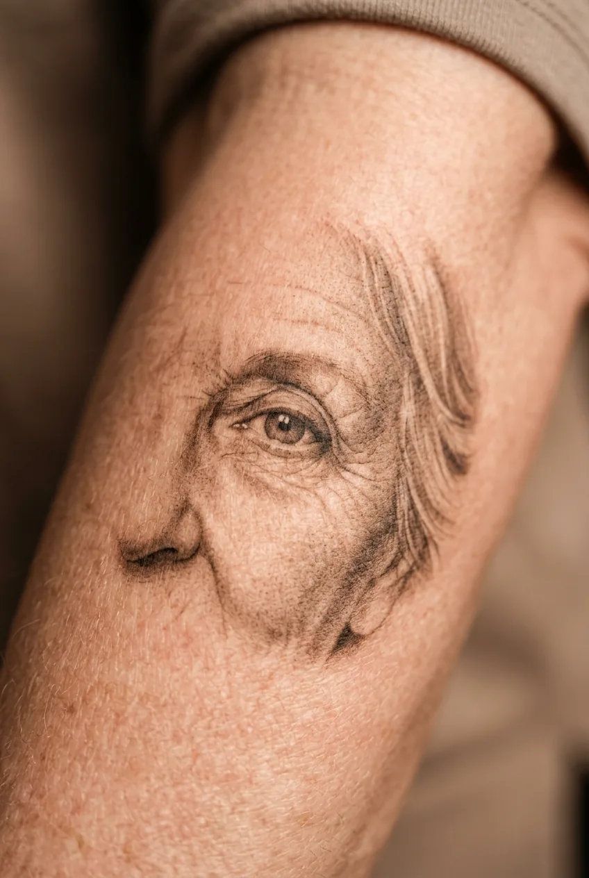
This tone is extraordinary for portrait work, particularly for memorial tattoos or pieces honoring someone specific. The warmth humanizes the subject in a way that cool black sometimes can’t. I’ve seen portrait tattoos done in warm grey wash that made people cry — and I mean that as the highest possible compliment to the artist.
Worth knowing: warm-biased blacks age into an even warmer register, sometimes tipping toward olive-brown on certain skin tones. It’s not a flaw — but it does change the piece. Ask your artist how black ink ages to see healed examples of their warm-grey work specifically before you commit.
5. Heavy Contrast — Drama That Demands Attention
When an artist places near-white highlights directly next to dense black — with very little grey in between — the contrast is almost violent in the best way. Your eye doesn’t drift. It snaps. Heavy contrast work is theatrical, sculptural, and emotionally loud even when the subject matter is quiet.
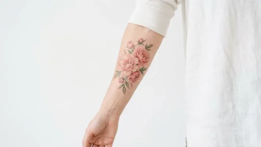
She’s got a floral sleeve in this style, and even in the photo you can feel how the petals seem to lift off her skin. That’s the power of contrast ratio. It mimics the way light actually behaves on three-dimensional objects, so the brain interprets it as real depth. Striking doesn’t even cover it.
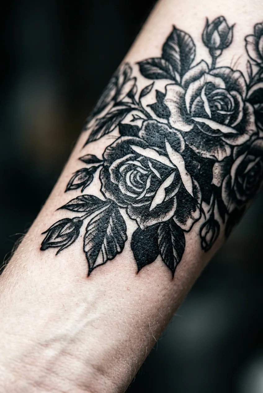
My personal pick for someone who wants one tattoo that does everything: a high-contrast black and grey botanical piece on the forearm. The contrast reads bold from across a room but up close reveals this incredible tenderness in the detail. It works in a boardroom and at a concert. It grows with you. I have never once seen this combination on a woman and thought anything other than “that is exactly right.”
6. Micro-Detail Work — Whisper-Light Precision
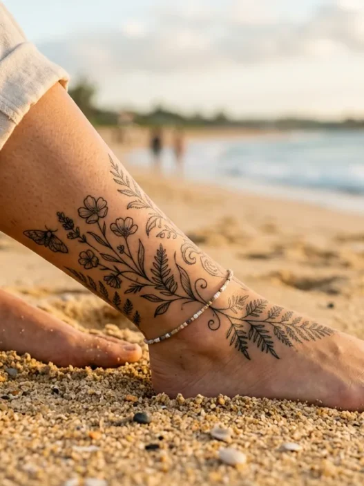
Fine line work done in light grey is the quietest thing you can do with a tattoo needle. Hair-thin lines. Pale tone. Almost imperceptible at arm’s length and completely arresting up close. This is the tattoo equivalent of speaking just above a whisper — everyone leans in.
The emotional effect is intimacy. These pieces feel private, like they’re meant for the person wearing them and the few people they choose to show. I find this quality deeply appealing in a culture that often equates tattoos with performance. A micro-detail grey wash piece is the opposite of performance.
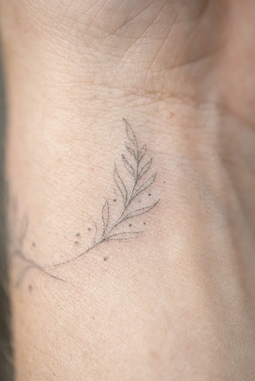
But I have to be honest with you about longevity here, because I see a lot of posts online that aren’t. Fine lines in pale grey are among the most fragile things in tattooing. They blur and fade faster than any other approach — especially on the fingers, wrists, and feet. You can check out resources on minimalist tattoos for honest discussions of how these age. Touch-ups are part of the commitment with this style, and that’s a reasonable trade-off — just go in with open eyes.
7. White Highlights in Grey Work — Fragile Magic
White ink in a grey wash piece adds highlights — that pop of brightness that makes a dewdrop look wet or a moon look luminous. In fresh work, it’s genuinely breathtaking. The catch? White ink is notoriously unreliable over time.
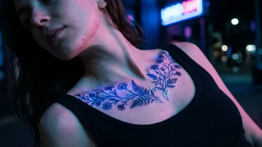
On most skin tones, white either fades into the skin completely within a couple of years or turns slightly yellow. On very fair skin it can remain visible for longer, but it shifts. I’ve talked to tattoo artists who use it sparingly and deliberately — as an accent rather than a foundation — and that approach holds up better. When it works, it really works. That gleam on her wrist in this image is exactly why artists keep reaching for the white ink despite its unpredictability.
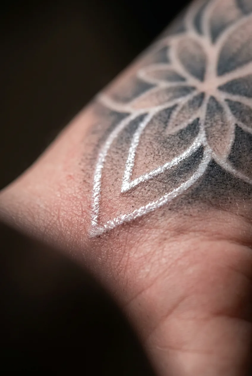
If white highlights are part of your design vision, ask your artist to show you healed photos — ideally pieces that are two or three years old — so you see the realistic outcome rather than the fresh-off-the-chair version.
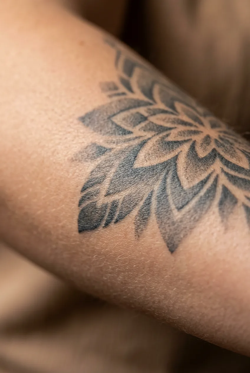
8. Charcoal Mid-Tones — The Workhorse of Longevity
If soft pale grey is poetry, charcoal mid-tone is prose. Reliable, sturdy, doing the structural work without demanding recognition for it. A medium-dark grey — not diluted enough to be delicate, not saturated enough to read as black — is the tone that holds a composition together and ages the most gracefully of anything in this palette.
Emotionally, charcoal mid-tones read as grounded. Serious without severity. This is the tone I’d recommend to someone who wants their tattoo to feel cohesive and intentional fifteen years from now, not just today. It’s the tonal equivalent of well-made basics — never flashy, never wrong.
9. Near-Black with Negative Space — Restraint That Hits Hard
What isn’t there matters as much as what is. Near-black ink used to define the borders of negative space — letting the skin itself become part of the composition — creates a graphic quality that’s visually arresting precisely because of its restraint. Less ink. More impact.
This approach pulls heavily from graphic design principles, and the emotional effect is intellectual tension. Your brain wants to complete the image; the tattoo refuses to do the work for you. I find this quality genuinely exciting in a way that fully filled designs sometimes aren’t. You can explore a wide range of approaches that use this principle across different tattoo styles — it’s not exclusive to any one genre.
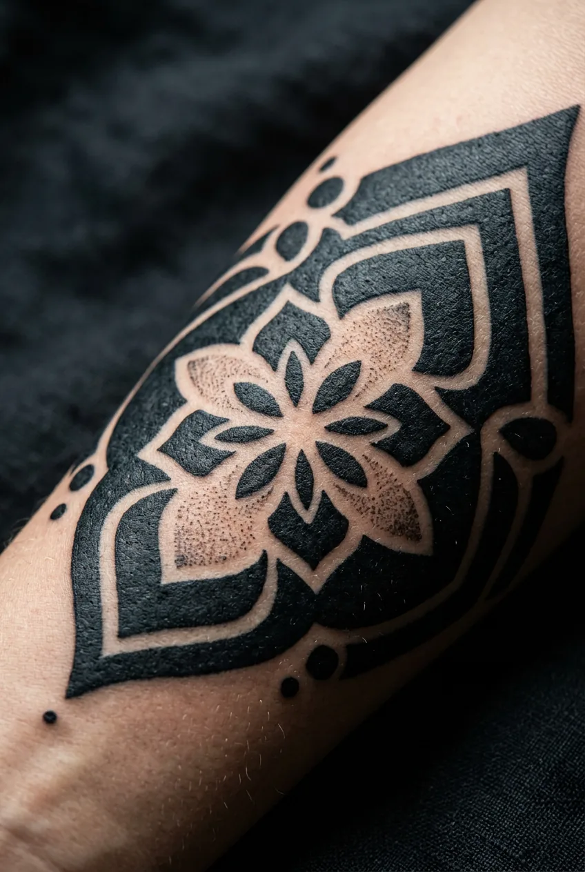
Longevity is excellent. The skin-as-canvas approach means less ink overall, and less ink means less blurring over decades. The negative space stays clean longer than any filled area would.
10. Faded Grey — Aged Softness
Some artists intentionally design tattoos to look already aged — slightly blurred edges, uneven grey tones, the visual texture of something that has lived a little. This style leans into impermanence as an aesthetic rather than fighting it. And the emotional result is unexpectedly moving.
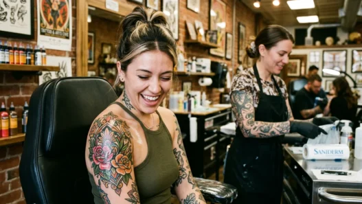
There’s something about a tattoo that looks like it’s been on someone’s body for decades — even when it’s brand new — that communicates a certain ease with time and change. It’s not trying to be perfect. It’s trying to be true. I’ve seen this done beautifully in botanical work, in script, in portrait pieces where hyper-realism would feel cold. The woman in this photo has exactly this kind of piece on her arm, and there’s a warmth to the whole image that’s hard to separate from the tone of the ink itself.
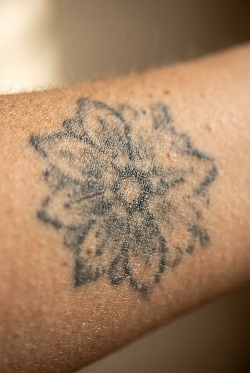
You can read more about the emotional and visual language of grey wash tattoo technique to understand how artists build this look deliberately — it’s more controlled than it appears.
11. Layered Washes — Dimensional Depth
The most technically demanding approach in the black and grey tattoo palette. Multiple passes of diluted ink — building from pale to mid to dark in careful layers — create a tonal range that mimics actual three-dimensional volume. When it’s done well, it doesn’t look like a tattoo. It looks like a drawing that somehow got inside your skin.
The emotional effect here is awe. Straight-up wonder at what a needle and ink and a skilled pair of hands can do. This is the approach used by artists working in the realism genre, and it requires not just technical skill but a deep understanding of realistic tattoo shading to achieve smooth, even gradients across skin that is never perfectly flat or still.
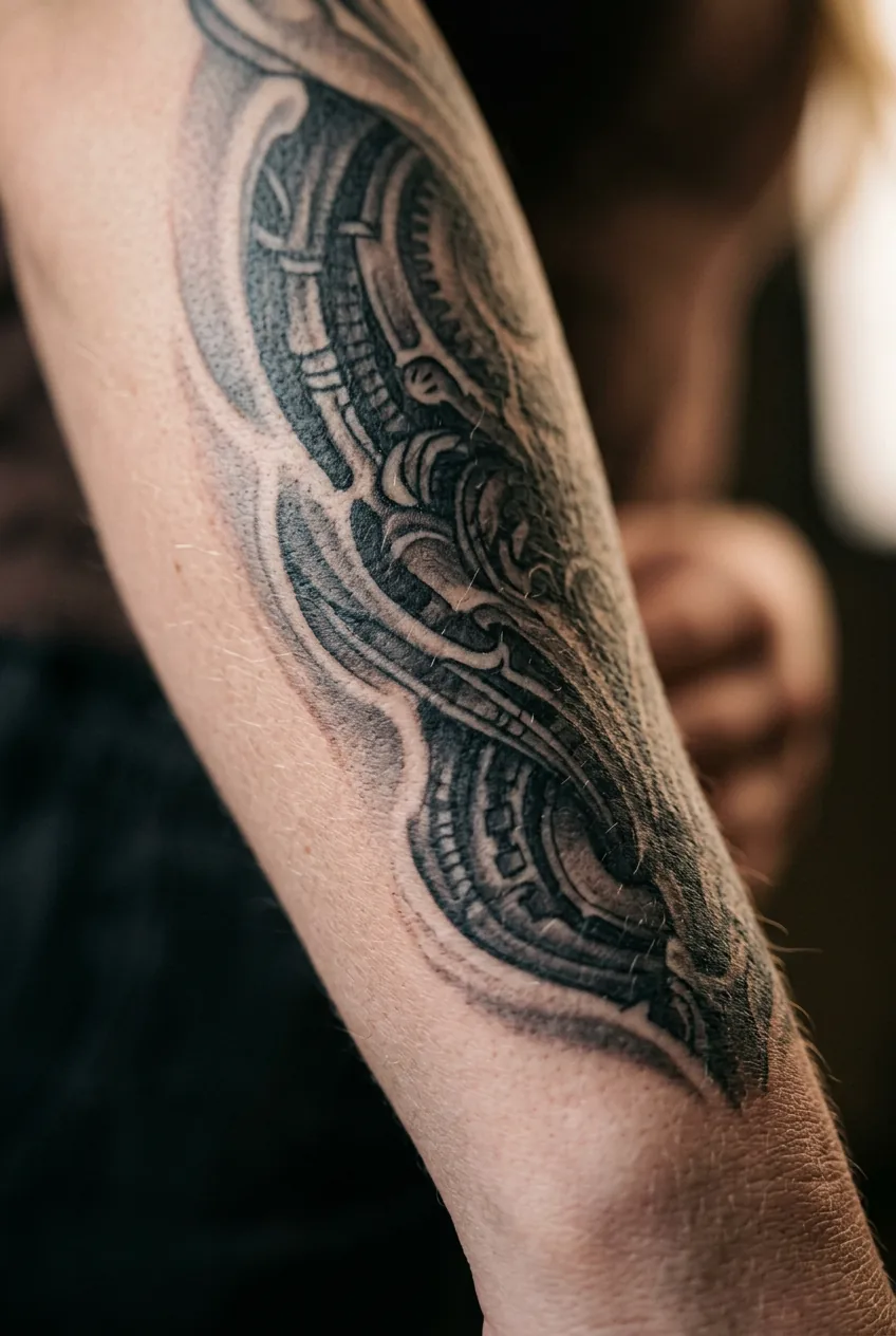
For placement, layered wash work tends to shine on areas with more consistent skin texture — upper arm, shoulder, thigh, calf. It’s a brave choice for the wrist or ribcage, where skin movement and texture can challenge even the most precise artist. But when it works? I genuinely have no better word than extraordinary. You can find artists who specialize in exactly this kind of work by browsing through dedicated tattoo artists portfolios and looking specifically for their healed-work photos — not just fresh pieces.
Watching a Grey Wash Build in Real Time
Questions I Get About This
Do black and grey tattoos age better than colour tattoos?
Generally, yes — especially the darker tones. Black ink is the most stable pigment in tattooing and holds its legibility for decades. The softer grey washes do fade, but they age gracefully rather than turning muddy the way some colours do. You won’t get the colour degradation issues that plague reds and yellows.
Does skin tone affect how black and grey tattoos look?
Absolutely, and any artist who says otherwise is glossing over something important. Very pale grey washes can read beautifully on light skin but barely show on deeper skin tones. Conversely, high-contrast black work tends to show beautifully on all skin tones. An experienced artist will adjust their tonal approach — using darker mid-tones instead of pale washes — to suit your specific skin. Always ask to see portfolio work on skin tones similar to yours.
Can black and grey tattoos include script or quotes?
Yes, and it can be stunning — especially when the script is integrated into a larger grey wash composition rather than sitting as standalone text. If you’re interested in this, exploring quote tattoos done in black and grey specifically will show you just how much range is possible between a thin fine-line script and bold, heavily inked lettering.
How often do black and grey tattoos need touch-ups?
Solid black areas rarely need touching up — maybe once every ten to fifteen years if at all. Soft grey washes, fine lines, and white highlights are different stories; plan for a touch-up every three to five years if you want them looking fresh. Placement matters too — high-friction areas like hands and feet fade faster than the upper arm or thigh.
The thing I keep coming back to is that black and grey tattoos aren’t a neutral choice — they’re actually one of the most emotionally articulate palettes in tattooing. Every dilution decision, every contrast ratio, every choice to leave skin bare rather than fill it in — all of it is saying something. So before you sit down with your artist, spend some time thinking about what you want your piece to feel like, not just what you want it to look like. The tone will do the rest of the talking.