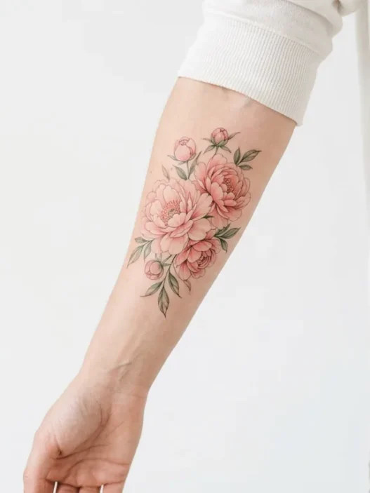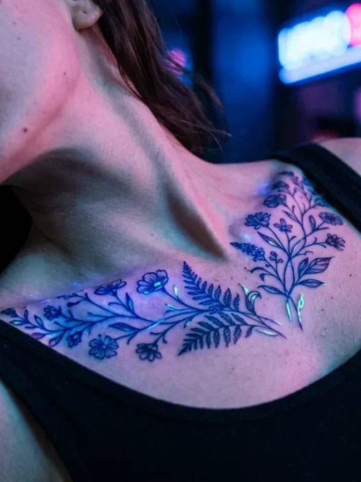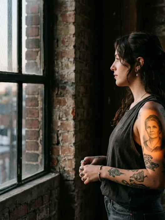



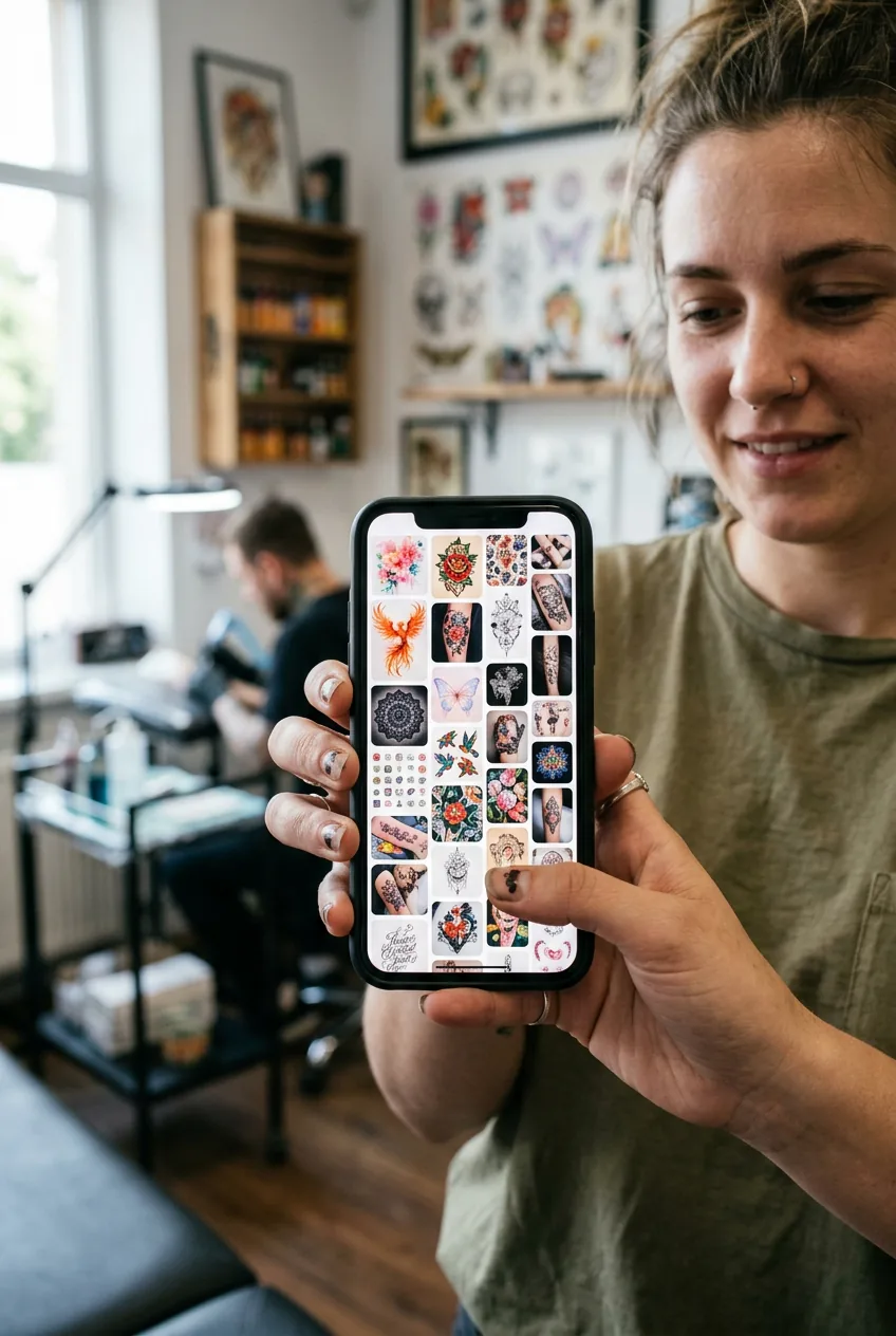
I spent almost eight months circling the same four Pinterest boards, saving everything that caught my eye, and still showing up to consultations with nothing useful to say. The artist would ask what vibe I wanted and I’d gesture vaguely at my phone screen. Every time I left without booking. It wasn’t indecision about getting a full color tattoo — I knew I wanted one desperately. The problem was something more specific, and once I figured it out, the whole process unlocked almost overnight.
Everything We’re Covering Today
- What Was Going Wrong
- The Root Cause Most People Miss
- The Fix That Actually Works
- Step 1: Lock Your Palette First, Not Your Subject
- Step 2: Translate Palette into a Reference Mood Board
- Step 3: Brief Your Artist With Color Language
- Step 4: Approve the Stencil With Color Zones in Mind
- Step 5: Trust the Fill Session and Read the Pigment
- Making It Stick
- Quick Answers Before You Book
What Was Going Wrong
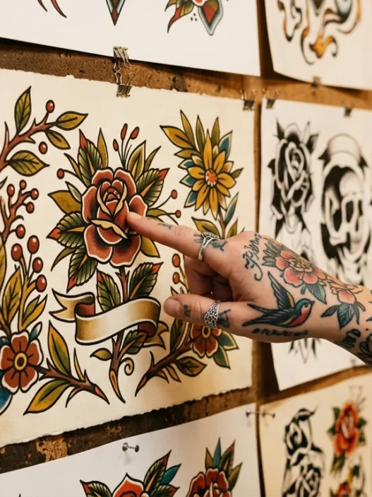
Here’s the situation I kept replaying. I’d sit across from a talented artist, open my camera roll, and show them a Japanese peony I loved, a neotraditional moth I’d saved three months ago, a watercolor hummingbird, and a piece of illustrative foliage from someone’s sleeve tattoos gallery. Every single reference was full color. Every single one was a completely different style. And somehow I expected the artist to synthesize that into one cohesive design for my forearm.
They couldn’t. Not because they weren’t skilled — they absolutely were. But I was handing them a contradiction. I was saying “I love color” while actually describing four different artistic universes that happen to share pigment.
The consultations always ended the same way. The artist would ask a follow-up question I couldn’t answer — “Do you want bold outlines or a softer edge?” — and I’d freeze. I’d go home, save more references, and repeat the cycle the following month.
The Root Cause Most People Miss
Everyone talks about “knowing your style” as the prerequisite to booking a tattoo. And that’s true — but it’s also backward advice for someone stuck on a full color piece. Style is actually the last thing you should be trying to nail down, not the first.
Color tattoos are unlike black and grey work in one critical way: the palette is the personality. In black and grey, the style carries most of the emotional weight. In full color, the specific hues you choose — warm vs. cool, saturated vs. muted, analogous vs. complementary — tell the artist almost everything they need to know about the final feel of the piece before a single line is drawn.
What I was doing wrong was leading with subject matter. I’d think “I want florals” and then try to choose a style second. But without a color direction, every floral reference I showed looked different — because it was different. A hot magenta peony in neotraditional style reads nothing like a dusty rose peony in a soft illustrative style. Same flower, totally different tattoo. I was mixing up apples and neon oranges.
The root problem: I had no palette anchor. And without one, no artist could help me — because they had no fixed point to design around.
The Fix That Actually Works
The reframe that saved me was embarrassingly simple once someone said it out loud. A colorist friend — not even a tattoo artist, just someone who worked with paint professionally — told me: “Stop thinking about what you want to depict and start thinking about what you want to feel when you look at your arm.”
That’s it. That’s the whole unlock.
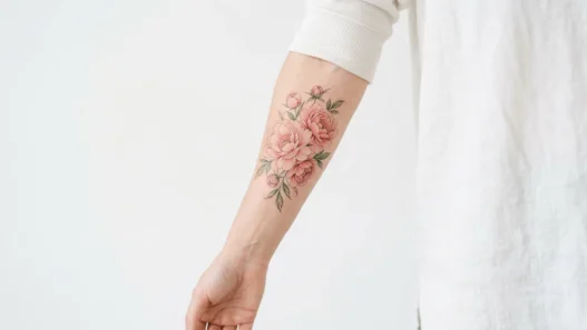
Instead of “I want a moth” or “I want florals,” the question becomes: do I want something that feels warm and earthy, like autumn light through amber glass? Or something cool and electric, like deep teal and violet against a dark background? Do I want soft and dreamlike — the kind of muted pastels you see in floral tattoos with a watercolor wash — or do I want punchy and graphic, where every color hits at maximum saturation?
Once you answer that, the subject matter and style actually become obvious. And more importantly, your artist finally has something actionable to work with.
The process below is the exact sequence I used to go from eight months of stalling to booking my session in under two weeks. Follow it in order — each step genuinely depends on the one before it.
What you’ll need before you start:
- A color palette tool — I used Coolors.co, but a paint chip fan deck from a hardware store works just as well
- Pinterest or a physical notebook for reference collecting (you’ll curate it ruthlessly in Step 2)
- Access to your artist’s portfolio — their actual healed work, not just fresh photos
- A short list of 3–5 colors you already love wearing or living with (clothes, home decor, anything)
- About an hour of uninterrupted thinking time — this isn’t a speed run
Step 1: Lock Your Palette First, Not Your Subject
Before you think about what your tattoo will depict, spend time identifying three to five colors that genuinely excite you together. Not just colors you like in isolation — colors that, when grouped, create a feeling you want to live with permanently.
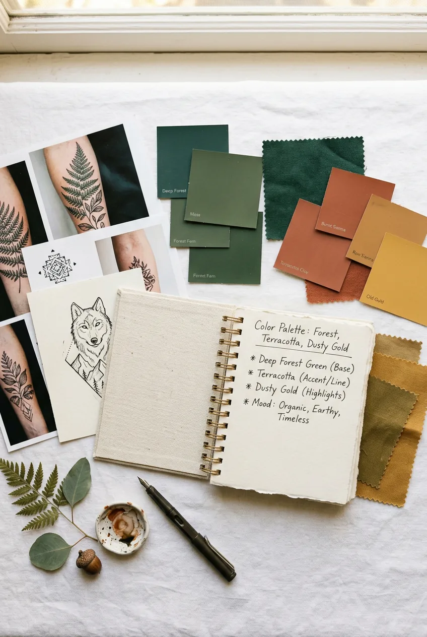
Look at what’s already in your wardrobe. Look at the art you’ve bought, the mugs you reach for, the rugs you’ve saved. There’s almost always a throughline. Mine turned out to be deep forest green, warm terracotta, and dusty gold — which immediately told me I was in “rich autumnal” territory, not “bright tropical” territory. That one realization eliminated probably sixty percent of my saved references in ten minutes.
You can also check out resources on how experienced tattoo artists understand and work with color by exploring the tattoo artists section — looking at how individual artists describe their color philosophy in interviews is genuinely illuminating at this stage.
Write your palette down. Name the colors. Terracotta. Deep emerald. Dusty gold. Warm ivory. That’s your anchor. Everything else gets judged against it.
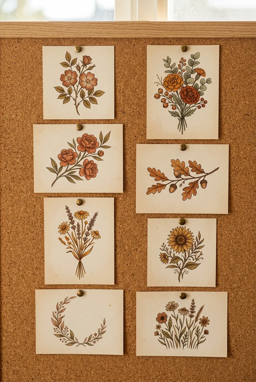
Mistake I made here: I tried to include a “pop” color that felt exciting in the moment — a bright cobalt — without checking whether it actually belonged with my warm palette. My artist gently pointed out that cobalt and terracotta fight each other unless you’re deliberately going for contrast as a theme. I should have tested combinations with a palette tool before my consultation, not during it. Save yourself the awkward silence.
Step 2: Translate Palette into a Reference Mood Board
Now — and only now — go back to your saved references and filter them through your palette. This is the step that makes your mood board actually useful instead of just pretty.
For every reference image, ask one question: does this piece use my palette, or just a palette I happen to find attractive? These are different things. I found I’d saved dozens of images with colors I loved in isolation but that had nothing to do with my own palette. Those got deleted.
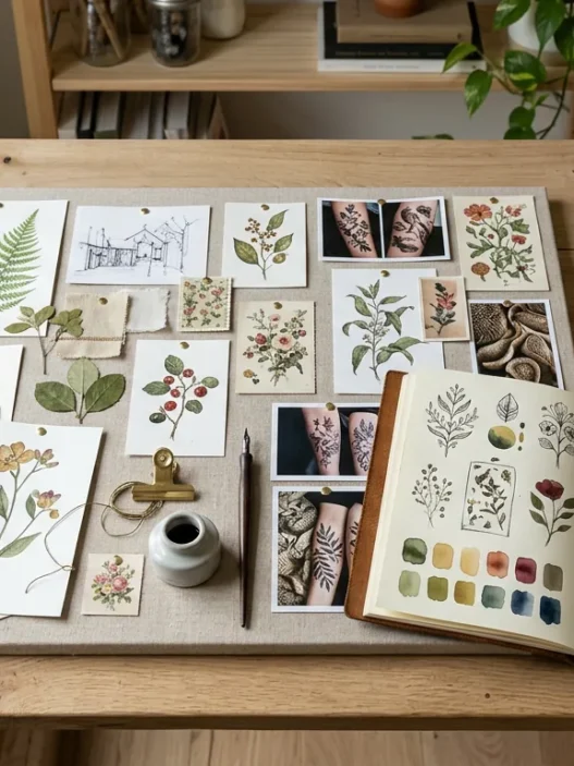
What you’re left with — usually eight to fifteen images — should all share a color family. The subject matter might still vary. You might have a botanical illustration, a neotraditional bird, and a mandala-influenced piece all surviving the filter. That’s fine. What they share now is a tonal relationship, and that’s what your artist actually needs. If you find yourself drawn to mandala-style compositions, you can browse mandala tattoos specifically filtered by color-heavy examples — it’s a surprisingly useful exercise for understanding how geometric work handles saturation.
Organize your final mood board into two sections: color references (images chosen purely because they nail the palette) and composition references (images chosen for layout, subject, or flow). Your artist needs both, but they need to know which is which.

Step 3: Brief Your Artist With Color Language
Walk into your consultation armed with color words, not just images. This sounds small. It is enormous.
Instead of “I like this piece,” try: “I want the greens to lean deep and slightly muted, not lime or neon. The warmth should come from terracotta and gold tones, not red or orange. I want it to feel rich but not heavy.” That one paragraph told my artist more than two hundred saved images had managed to communicate across three previous consultations.
Color language also includes telling your artist what you don’t want. “No blues, no purples, nothing cool-toned” is incredibly helpful. It removes an entire portion of the color wheel from consideration and lets them design with confidence.
Ask your artist how they personally approach color mixing and ink selection — this is where you learn whether their technical strengths align with your vision. Some artists are exceptional at saturated, high-contrast color work; others excel at soft blending and pastel washes. You can check out resources on choosing the right color tattoo artist to understand what questions matter most before you commit.
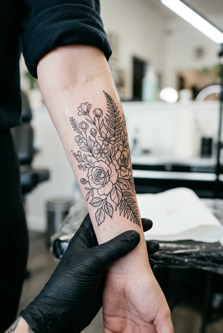
Step 4: Approve the Stencil With Color Zones in Mind
When your artist sends a design sketch or applies the stencil, most people evaluate it purely as a line drawing. That’s a mistake — because a full color tattoo lives and dies by where the color transitions happen, not just where the lines fall.
Look at the stencil and mentally assign color zones. Where will the deep anchoring tones sit — the darkest, richest values that give the piece weight? Where will the mid-tones carry the most visual area? And where are the highlight pops, the small saturated moments that the eye catches first?
I asked my artist to walk me through her color plan verbally while I looked at the stencil on my arm. She pointed to each zone and described what she intended to do there. That conversation — which took maybe eight minutes — prevented at least two things I would have been unhappy with. One was that the largest section of the design was going to be filled almost entirely in the deep green, which I wanted, but she was planning to use a cooler-leaning green. I caught it then, not after it was permanent.
Also worth considering at this stage: placement and scale matter enormously for how color reads on the body. Large-scale pieces like full back tattoos can handle incredibly complex color gradients because there’s room to breathe. A forearm piece needs tighter color editing — too many transitions in a small area and the whole thing muddies once healed.
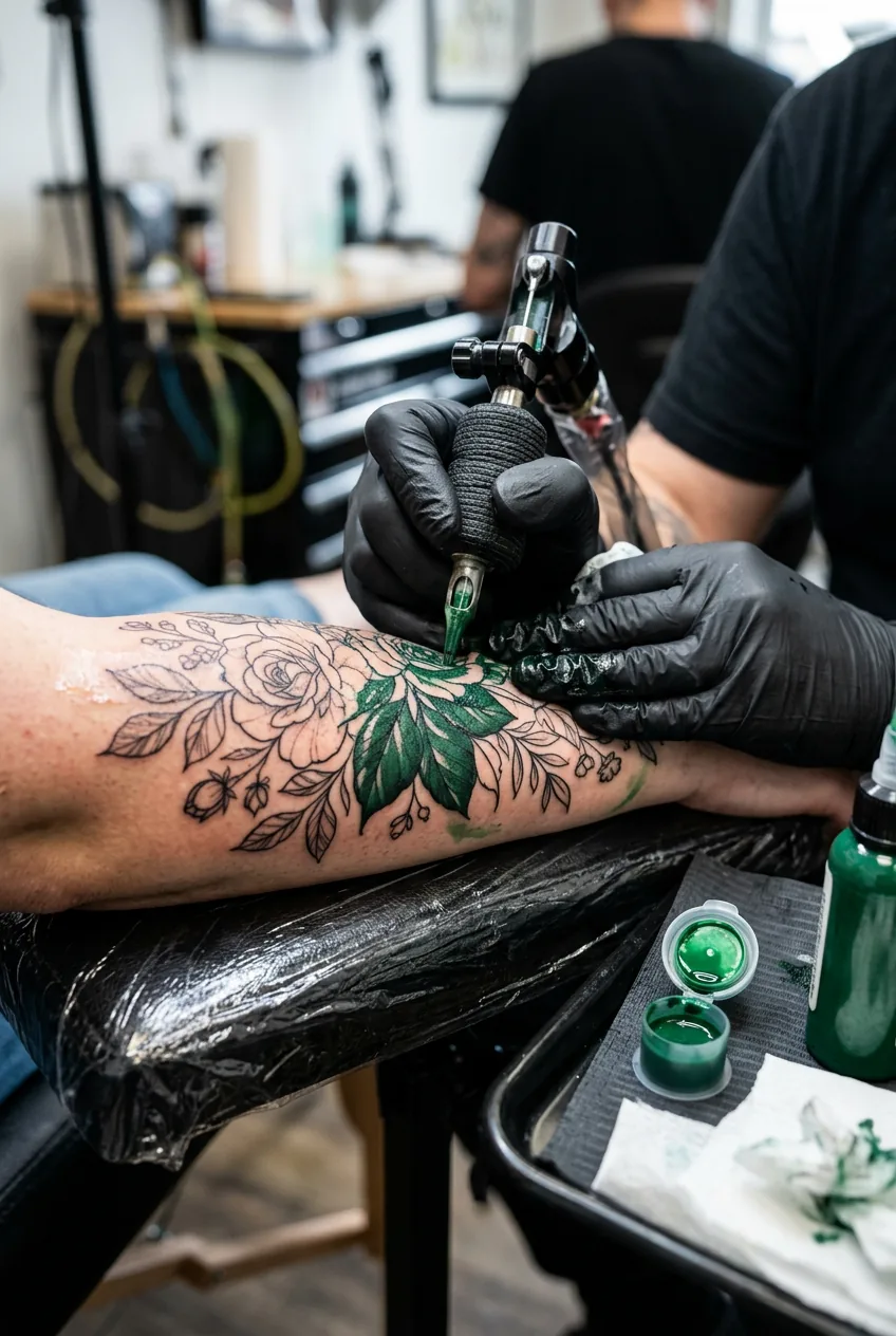
Step 5: Trust the Fill Session and Read the Pigment
You’re in the chair. The outlines are done and your artist is loading up color. This is where most clients either hover nervously or disengage completely — and both are the wrong move.
Stay present enough to watch the pigment go in, especially in the first twenty minutes. Fresh ink under studio lights looks dramatically different from healed ink, and it also looks different from the ink in the cap sitting nearby. What appears blindingly saturated on the needle often settles into something two shades softer once healed. Your artist knows this. But if something looks genuinely wrong — a color that’s clearly not what you discussed — say something early, not at the end of a four-hour session.
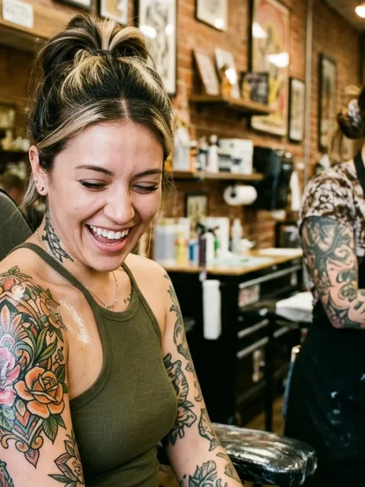
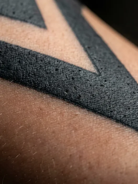
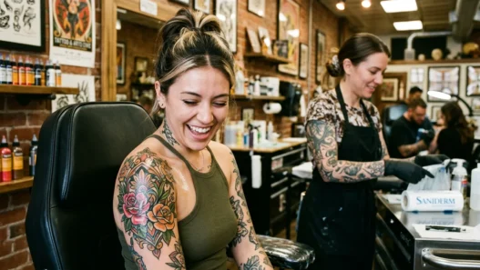
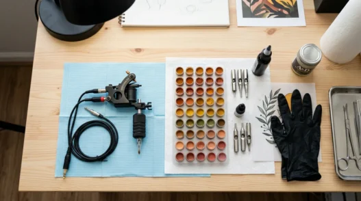
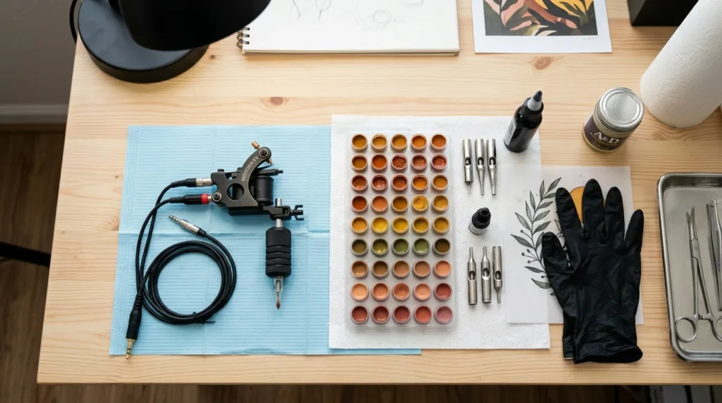
Look at how visible the pigment is in the photo here — that brightness is normal and expected. Fresh full color work is always more electric than the healed result. The rich, almost wet-looking saturation you see under studio lights will mellow by fifteen to twenty percent during healing. This is not a flaw; it’s just how pigment integrates with skin.
Trust the process your artist has. They’re reading the skin’s uptake in real time, adjusting pressure and needle configuration as they move through color zones. Your job at this stage is to stay hydrated, breathe, and let them work. You’ve done the hard part — the entire upstream process of communicating what you wanted — and it shows in how confidently they’re moving through the design.
For a deeper understanding of what to expect during healing, read up before your session so nothing surprises you during aftercare.
See a Color Fill Session Up Close
Making It Stick
The fill session is done, but color tattoos need more aftercare attention than black and grey work — especially in the first two weeks. The pigment particles in color ink are slightly different in composition from black ink, and the skin has taken on more overall trauma from the repeated passes needed to build saturation. Treat this phase seriously.
Keep it moisturized but not smothered. Use an unscented, gentle lotion in thin layers — not a thick ointment layer that suffocates the skin. Avoid sun exposure aggressively during healing; UV is the single biggest enemy of color longevity, and it starts doing damage before you can even see it happening. Keep the piece out of direct sun for at least four weeks after healing, and after that, SPF every time you’re outdoors is non-negotiable.
Plan for a touch-up. Almost every full color tattoo benefits from one. Not because the artist made mistakes — but because skin heals unpredictably, and small gaps in saturation or slightly faded transition zones are totally normal. Most artists build a touch-up into their process, especially for complex color work. Ask about it at the end of your session if they haven’t mentioned it already.
You can also research protecting color tattoos from fading to understand what topical care and lifestyle habits make the biggest difference over the years — because a well-protected full color tattoo still looks incredible a decade out. That’s the goal.
Quick Answers Before You Book
Does full color tattooing hurt more than black and grey?
Generally yes, slightly — not because of the color itself but because building saturation requires more passes over the same area. Each color zone needs to be packed thoroughly, which means your skin is worked more than in a single-pass line session. Staying well-rested and fed before your appointment makes a real difference.
Will certain colors fade faster than others?
Yes — yellows and lighter pastels tend to fade faster than deep pigments like navy, forest green, or burgundy. This doesn’t mean you can’t use them, but your artist may pack those areas slightly heavier knowing they’ll lose some intensity. Talk to your artist about which hues in your palette are more fugitive and how they compensate for it.
How many sessions does a full color tattoo usually take?
For a forearm-sized piece, most people need one to two sessions plus a touch-up. Larger pieces — think anything approaching full back or full sleeve scale — are typically broken into multiple sessions both for quality and for your body’s ability to handle the trauma. Always ask your artist for a realistic timeline upfront.
Can I get a full color tattoo if I have darker skin?
Absolutely — but artist selection matters even more. Deep, rich pigments (dark teal, forest green, burgundy, warm terracotta) read beautifully on deeper skin tones. Pastels and very light tones are trickier and may require an experienced hand. Look specifically for artists who have healed portfolio work on skin similar to yours — not just fresh shots.
My piece healed beautifully — deep forest green and terracotta florals on my forearm that still get stopped-on-the-street comments eight months later. The whole shift happened when I stopped trying to decide on a design and started deciding on a feeling first. Eight months of spinning became two weeks of momentum. If you’ve been stuck like I was, try the palette-first approach. It’s not a creative shortcut. It’s just the right order of operations.