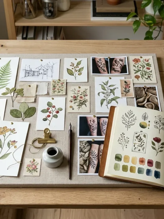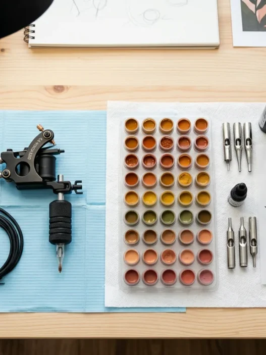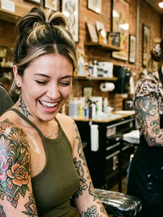






I spent three months planning my forearm neo-traditional piece before I ever sat in the chair, and I still got one colour wrong. Not the design — the design was perfect. The colour. A pale lavender I was absolutely certain about ended up looking like a bruise against my warm olive skin within the first year. Nobody warned me that building a tattoo palette is genuinely its own skill set, completely separate from choosing a style or a motif. So I started researching obsessively, talking to artists, and basically treating it like a colour theory class I should have taken before my first appointment. This guide is everything I wish I’d known.
Your Colour-Smart Guide to Neo-Traditional Ink
What You’ll Actually Need Before You Start
This isn’t a list of tattoo supplies — you’re not doing the tattooing. This is what you need going into the consultation so your artist can actually help you make smart pigment decisions instead of just guessing.
- A reference photo of your skin tone in natural daylight (not filtered, not edited)
- Two or three healed tattoo photos from artists you’re considering — not fresh, healed
- A rough idea of your dominant undertone (warm, cool, or neutral)
- A saved image or printout of your design reference with colours you love
- An honest sense of how much sun your placement gets — wrists and hands fade fast
- Questions written down about specific pigments — especially reds, whites, and anything pastel
- Patience. This conversation with your artist might take twenty minutes. That’s good, not annoying.
The neo-traditional style already has a lot going on visually — those bold, decorative lines, the illustrative quality, the layered depth. Colour choices need to support that, not compete with it. Going into your consultation with these things ready means you and your artist can actually talk about longevity, not just aesthetics.

Start With the Anchor Tone
Every strong neo-traditional palette starts with one anchor — and almost always, that anchor is a dark, stable tone that frames the entire piece. Think of it as the colour that does the heavy structural lifting.
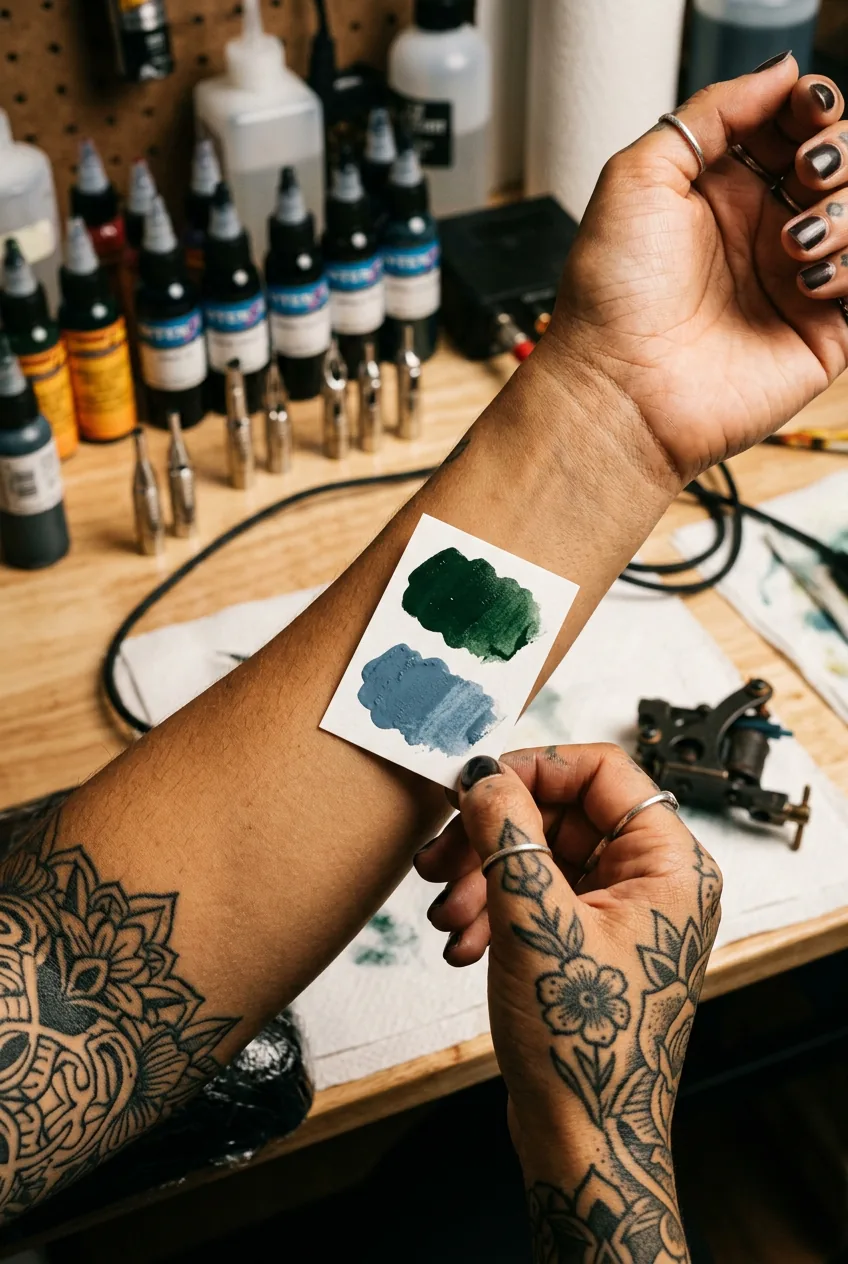
Carbon black is the obvious anchor and honestly, the best one. It lasts forever. I mean that almost literally — carbon black pigment is photostable and doesn’t migrate into warm or cool tones over time the way coloured inks do. When the rest of your palette softens over five or ten years, that black linework and black shading is still going to look intentional and crisp. That’s what holds a neo-traditional piece together as it ages.
But the anchor doesn’t have to be pure black. Deep forest greens, navy blues, and rich burgundies can also function as anchors — provided they’re saturated and dark enough to create contrast against the skin. The rule is: if your anchor tone shifts significantly with age, the whole palette loses its structure. So whatever you choose, pick the most pigment-dense, lightfast version your artist carries.
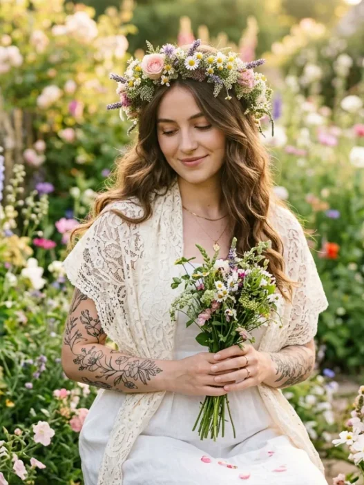
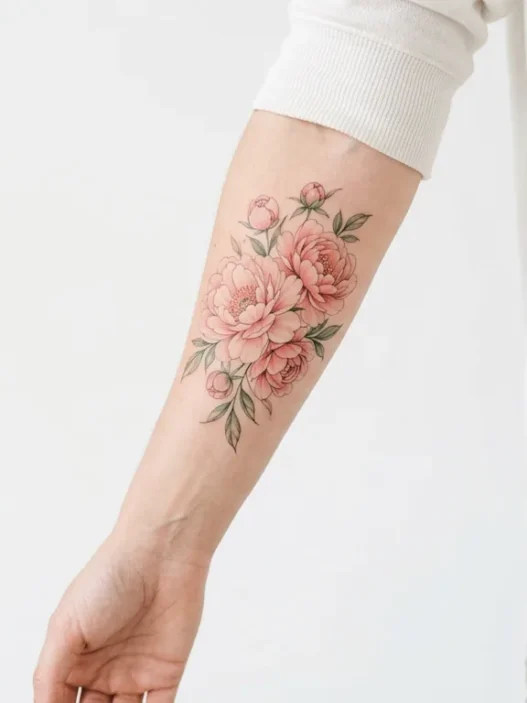
Ask your artist to show you how different pigment bases age on healed work. It’s a completely reasonable question and a good artist will have plenty of healed photos to walk you through. See that woman’s forearm in the photo above — her anchor is a deep teal that’s held its structure beautifully. That’s the kind of reference you want to bring.
Choose Two Supporting Pigments
Once the anchor is set, you build around it with exactly two supporting tones. Not four. Not six. Two.
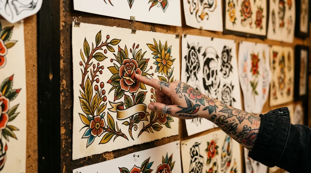
This is where I see people (and honestly, where I went wrong the first time) get greedy. Neo-traditional flash art is gorgeous and complex-looking, but a lot of that complexity comes from the line work and shading — not from a ten-colour ink rainbow. When you add too many colours, especially in a medium-sized piece, they start competing with the lines instead of letting the lines do their job. The design loses that signature illustrative quality that makes neo-traditional so distinctive from traditional tattoos.
So: pick two. And choose them based on how they interact with your anchor AND with your skin’s undertone.
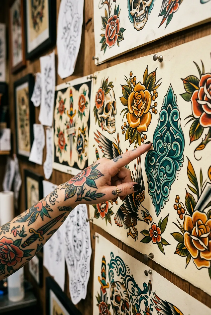
For warm skin tones (golden, olive, deeper complexions), colours with yellow or orange bases tend to disappear — think warm yellows and peaches blending into skin rather than popping. Instead, go for cooler or mid-toned supporting pigments: a dusty blue-green, a medium violet, a true forest green. These have enough contrast against warm undertones to actually show up.
For cooler or paler skin tones, you have more flexibility — warm ochres, burnt oranges, and terracottas tend to look stunning. But be careful with very pale pinks and light peaches — they can get lost quickly, especially on fair skin.
The two supporting pigments should also complement each other. If they’re fighting for attention — say, a hot coral and a neon teal — the piece ends up looking chaotic rather than cohesive. Aim for tones that feel like they belong to the same colour family, even if they’re different hues. Muted and saturated can coexist. Muted and neon usually can’t.
The Colour Conversation Every Artist Should Have With You
When to Add a Warm or Cool Pop
This is the optional fourth element — and I want to be very clear: optional. Not every piece needs it. But when it works, it really works.
A colour pop is a single accent tone — used sparingly, in very specific areas — that creates visual energy without destabilising the whole palette. Think a small hit of warm amber in the eye of a fox, or a tiny flash of coral at the tips of flower petals. The key word is small. If your pop colour starts appearing in large fills, it’s no longer a pop — it’s a fourth main colour, and now your palette has four competing elements instead of three.
Warm pops — amber, burnt orange, golden yellow — tend to work beautifully in neo-traditional pieces because the style has roots in natural motifs: flora, fauna, portraits. Those subjects read warm. A touch of ochre in a botanical piece feels cohesive, like it belongs to the natural world the design is depicting.
Cool pops are trickier. A bright icy blue or a saturated turquoise can absolutely sing in the right piece — especially something more fantastical or Art Nouveau-influenced. But cool pops on warm skin need to be carefully placed, because if they sit in a large area directly against skin, they can read as bruising rather than brilliance.
Mistake I made: I approved a pale lavender as my pop colour without asking to see it healed on warm skin. In the artist’s portfolio photos, it looked like a soft dreamy purple. On my olive forearm, healed, it shifted to a dull greyish mauve — not bad exactly, but not what I wanted. If I’d asked to see that specific pigment on a similar skin tone (healed, not fresh), I would have caught it. Always ask for healed references for every accent colour, not just the anchors.
One other thing worth noting: warm pops tend to age more gracefully than cool ones. Yellows and oranges fade into warmer tones that can still feel intentional. A cool mint or lilac fading tends to go grey, which can look muddy against the remaining warmer tones in the piece.
Pigments That Will Fade On You
Let’s be honest about the pigments that will not hold up — because I think the tattoo industry sometimes glosses over this in the excitement of a consultation.
Whites barely last. I know white highlights look absolutely stunning on freshly healed neo-traditional work — that little catch-light in an eye, the bright veining in a leaf. But white pigment is notoriously unstable. It tends to yellow on warmer skin tones and blur into the surrounding colour within a couple of years. Some artists are incredible at placing white so it lasts longer (thin lines rather than solid fills, strategic placement away from heavy sun exposure), but if your entire palette relies on white contrast, plan to touch it up. More than once.
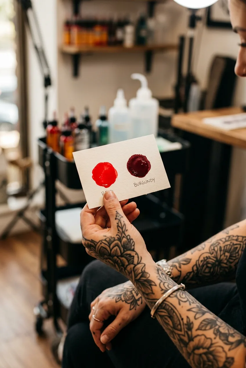
Reds are complicated. Pure red pigments fade faster than most others. They’re also the most common source of allergic reactions — not always immediately, sometimes years later. That doesn’t mean avoid red forever, but it’s worth knowing. Darker reds — think burgundy, oxblood, deep cherry — hold significantly better than bright fire-engine reds. If red is important to your palette, push it darker and denser. A desaturated brick red will outlast a candy-apple red by years.
Pastels and super-light tints fade into skin. That soft blush pink, that barely-there sky blue — these require a pale base (sometimes white under-layering) to even show up properly at first. And then the white fades, and so does the tint on top of it. On darker skin tones, light pastels may not read at all. You can read more about how traditional and modern tattoo styles handle colour differently — the principles around colour visibility on different skin tones apply directly here.
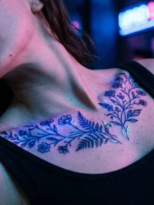
Neons and UV pigments deserve their own warning. Some UV-reactive inks have had safety questions raised about their chemical composition. I’m not saying don’t ever do it, but I’d always ask your artist specifically about the brand and formulation they use, and look for artists with actual experience using them. The visual payoff when fresh is incredible — but the long-term behaviour is less predictable than traditional pigments.
The most enduring neo-traditional palettes I’ve seen — the ones that look intentional and cohesive at five, ten, fifteen years — share a common thread: they lean into high-pigment stable ink formulas from reputable suppliers, and they were built with restraint. Bold line work. A strong anchor. Two supporting colours. Maybe one small pop. That’s the formula.
If you’re exploring a range of tattoo styles beyond neo-traditional, the same pigment longevity principles apply — the specific palette will change depending on whether you’re working with minimalist tattoos, realism, or something else entirely, but stable pigments and restraint are universal. And when you’re choosing an artist, look specifically at their tattoo artist portfolio for healed work in colour — fresh photos are basically useless for evaluating longevity.
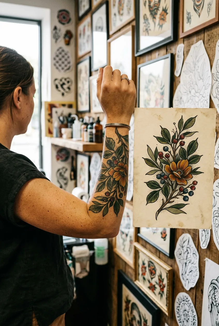
My forearm piece is three years old now. The anchor — a deep forest green — still looks almost exactly like it did healed. The two supporting tones, a dusty blue and a warm ochre, have softened slightly but in a way that honestly feels more vintage, more intentional. I got lucky on those two. The pop I added? That lavender I mentioned. I’m getting it refreshed next month with a deeper, more violet version. Lesson very much learned. But the bones of the piece? They’re solid. And that’s entirely because the anchor held.
The goal with any neo-traditional tattoo palette isn’t to capture every colour you love. It’s to build something that coheres now and still coheres in a decade. Restraint isn’t a limitation — it’s what separates a piece that ages into something richer from one that just fades into noise. Choose well, and your ink will thank you for it.

Questions I Get About This
How many colours is too many for a neo-traditional tattoo?
For a medium-sized piece — forearm to palm-sized — I’d say four is the maximum, and that includes your black anchor. More than that and the colours start competing with the line work, which is the real star in neo-traditional. Larger pieces like a full sleeve have more surface area and can carry additional tones, but even then, keeping a tight recurring palette across the sleeve creates more visual cohesion than using a different colour scheme for each panel.
Does skin tone really affect which colours will show up?
Massively, yes. Lighter pigments — yellows, pastels, whites — can disappear on deeper skin tones because there’s not enough contrast. Darker, more saturated colours hold up and read clearly across a wider range of skin tones, which is why building your palette around a strong dark anchor is even more critical for deeper complexions. This is honestly one of the most important conversations to have with your artist before settling on a palette — and a skilled artist will always bring this up without you having to ask.
How soon will I need a colour touch-up?
It depends entirely on the pigments used, placement, and how much sun exposure the tattoo gets. Blacks and dark blues can go five to ten years without needing work. Reds, pastels, and whites might need attention within two to three years. Placement is huge — a wrist or hand tattoo in constant sun exposure will fade noticeably faster than something on your upper arm or ribcage. Good aftercare in the first few weeks and consistent SPF application on healed tattoos will extend the life of any palette significantly.
Can I add colours to a healed tattoo later?
You can, but it’s tricky. Adding colour to a fully healed piece means tattooing over scar tissue and settled pigment, which behaves differently than fresh skin. The new colour may heal slightly differently than expected. If you’re thinking about adding a pop colour later rather than committing upfront, tell your artist during planning — they can design the piece with that in mind and leave space for it intentionally. That’s a much better outcome than trying to squeeze something new into a finished design that wasn’t built for it.
You might also want to look into tattoo sun protection aftercare to keep your palette looking vibrant as long as possible — it genuinely makes a difference.