


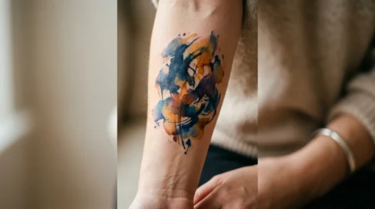
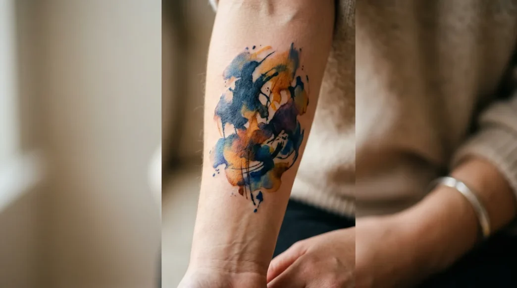
I’ve sat in enough tattoo chairs at this point to know that the internet’s opinion on what’s “in” shifts about as reliably as weather forecasts. Last year everyone said watercolor abstracts were cringe. The year before, free-form brushstroke pieces were supposedly over. And somehow, every single one of those tattoos I got against the grain? I love them more now than the day I walked out with them. There’s something to that — the pieces you choose without asking Twitter first tend to age the best.
The One Everyone Says Is Dated (I Disagree)
Watercolor abstraction. I know, I know — the groaning is audible from here. But hear me out. The argument against watercolor tattoos has always been that they “fade badly” and “look like a mistake.” And okay, yes, if you went to someone who didn’t specialise in the style circa 2014, you may have ended up with something that bled into a grey smudge. That’s a skill problem, not a style problem.
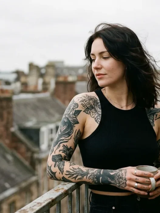
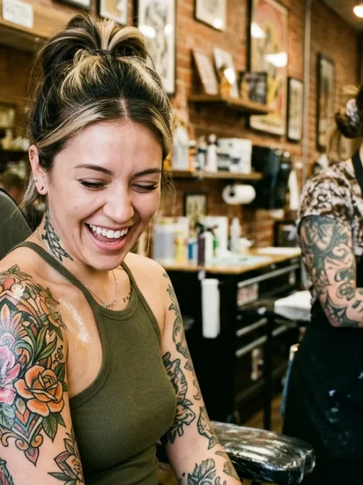
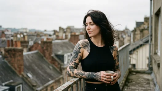
Done by an artist who actually understands how pigment behaves under skin — who builds in strategic dark anchors and uses controlled bleeds rather than random splashes — a watercolor abstract tattoo is breathtaking. Look at the piece in the photo below: you can see exactly how the artist has embedded a darker linework core that will hold the composition even as the outer washes soften over time. That’s craft. That’s intentional.
I got my own watercolor abstract — a loose, gestural form that lives on my inner forearm — three years ago. People told me I’d regret it. Three years on, it’s settled beautifully. The edges have softened in a way that feels organic, not degraded. If you’re curious about how these pieces age, ask your artist how fine lines age before committing to placement, because forearm skin does move differently than, say, a shoulder blade.
The “this is dated” crowd is conflating bad tattooing with a legitimate art movement. Those are not the same thing.
The Style Influencers Stopped Recommending — Wrongly
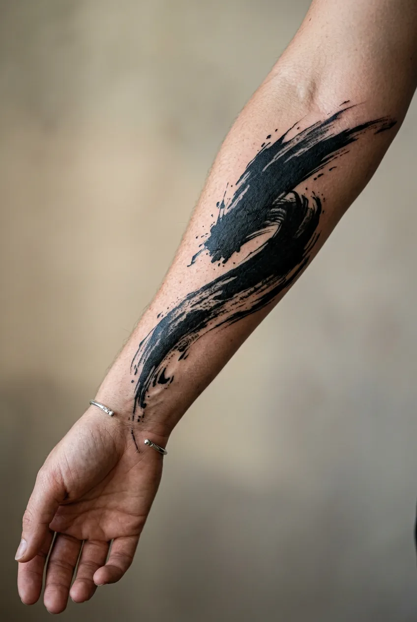
Brushstroke tattoos. The thick, inky, expressive kind — abstract black shapes that look like someone dipped a wide calligraphy brush in ink and let it move freely across skin. These were everywhere on Pinterest around 2022, then the tattoo influencer crowd decided they were oversaturated and quietly stopped posting them.
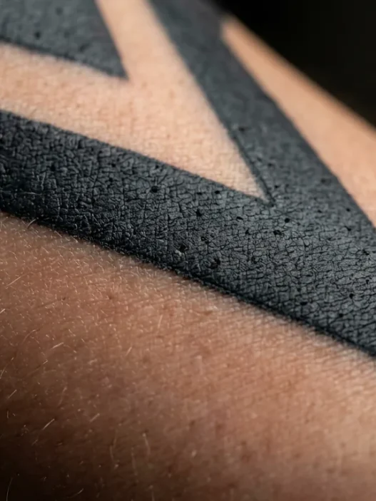
Here’s my genuinely unpopular opinion: saturation is not the same as ubiquity in real life. Yes, your For You Page was full of them. That does not mean every woman walking down the street has one. The brushstroke abstract is still a relatively unusual choice in practice, and it photographs magnificently on dark and light skin tones alike. The contrast is bold without being aggressive. It’s abstract tattoo design at its most legible — someone with zero knowledge of tattoo culture can look at it and immediately understand it as art.
She’s got hers running diagonally across the outer forearm in the photo — see how that placement gives the brushstroke actual momentum? It reads like movement rather than a static mark. That’s the thing about these pieces that gets lost in the algorithm-fatigue conversation: they’re genuinely dynamic. For more ideas on how abstract styles sit alongside other design approaches, 12 tattoo ideas for every style has a really useful breakdown of how bold and minimalist energies can coexist in a collection.
I’d book one tomorrow. I’d probably get it on my upper arm where it could really stretch out and breathe.
My Beloved Walk-In Flash
There is such snobbery around flash tattoos in certain corners of the tattoo community. The narrative goes: custom work equals serious collector, flash equals impulse buy for beginners. I reject this entirely.
Some of the most compositionally interesting abstract tattoos I’ve seen — and own — came off flash sheets. A good artist’s flash sheet is essentially a curated portfolio of shapes and ideas they’ve been quietly obsessing over. When a tattooist draws flash, they’re drawing what excites them, unconstrained by client briefs. The results are often more formally interesting than custom pieces designed by committee.
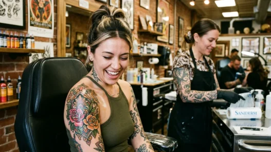
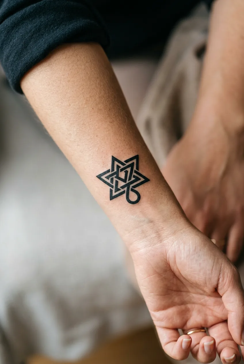
My favourite piece is a small abstract geometric form — roughly the size of a playing card — that I pulled off a flash sheet at a walk-in studio on a Tuesday afternoon with no appointment. The artist had designed it as a contained, almost Celtic-adjacent knot rendered in pure black. It sits on the back of my forearm and I get more compliments on it than pieces I spent months planning. There’s a reason geometric tattoos have staying power — the visual logic of interlocking form is just genuinely satisfying to look at, whether it came from a four-month consultation or a ten-minute decision.
The stigma around flash is a class thing, honestly. Custom work is expensive. Flash is accessible. Both can be extraordinary.
Why Geometric Abstraction Never Left My Wishlist
Okay, quick case for a few specific styles that I keep returning to even when trends suggest I shouldn’t:
- Sacred geometry hybrids. Not full mandala (though I love those too — more on that in a second), but the looser kind where a geometric frame dissolves at its edges into organic linework. The tension between hard structure and soft escape is endlessly interesting to me. You can explore a whole world of this in the mandala tattoo archives if you want to see how geometric and spiritual abstraction blur.
- Negative space geometry. Where the design exists in what’s not tattooed rather than what is. The skin becomes part of the image. Criminally underutilised.
- Abstract dotwork. I know dotwork had its moment and people are fatigued. But a properly executed dotwork abstract — one where the density gradients create genuine tonal depth — is closer to fine art printmaking than anything else you can put on your body permanently.
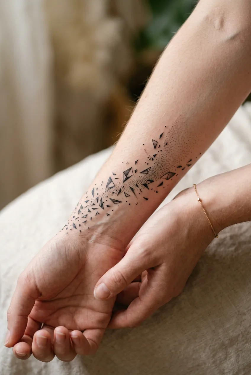
- Fragmented minimalism. Tiny geometric shards arranged in loose clusters. This sits at the intersection of minimalist tattoos and full abstraction, and it’s the style I think is most underrated for women who want something quietly striking rather than loudly decorative.
None of these are trending in 2026. All of them will still look interesting in 2040. That’s the calculation I make.
The Unpopular Placement That Changed Everything
Everyone pushes abstract work toward the upper arm, the ribcage, the thigh. Large canvas, lots of room. Makes sense. But I’ve become oddly evangelical about one placement that gets dismissed as too small or too visible: the outer forearm, right in the middle third.
Here’s why it works for abstract specifically. The forearm is a limb in constant motion — when you gesture, when you reach, when you rest your arm on a table. An abstract piece on the forearm moves with you. It catches different light at different angles. It has context that a static placement like a thigh or upper arm simply doesn’t provide in daily life. You interact with a forearm tattoo dozens of times a day without even thinking about it. That ongoing relationship with a piece you love is genuinely joyful in a way I didn’t anticipate.
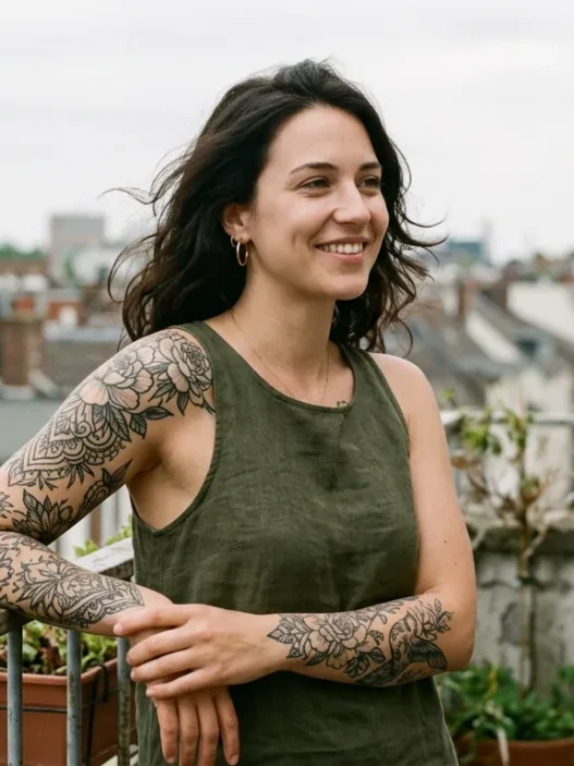
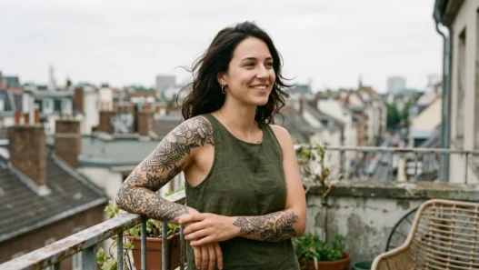
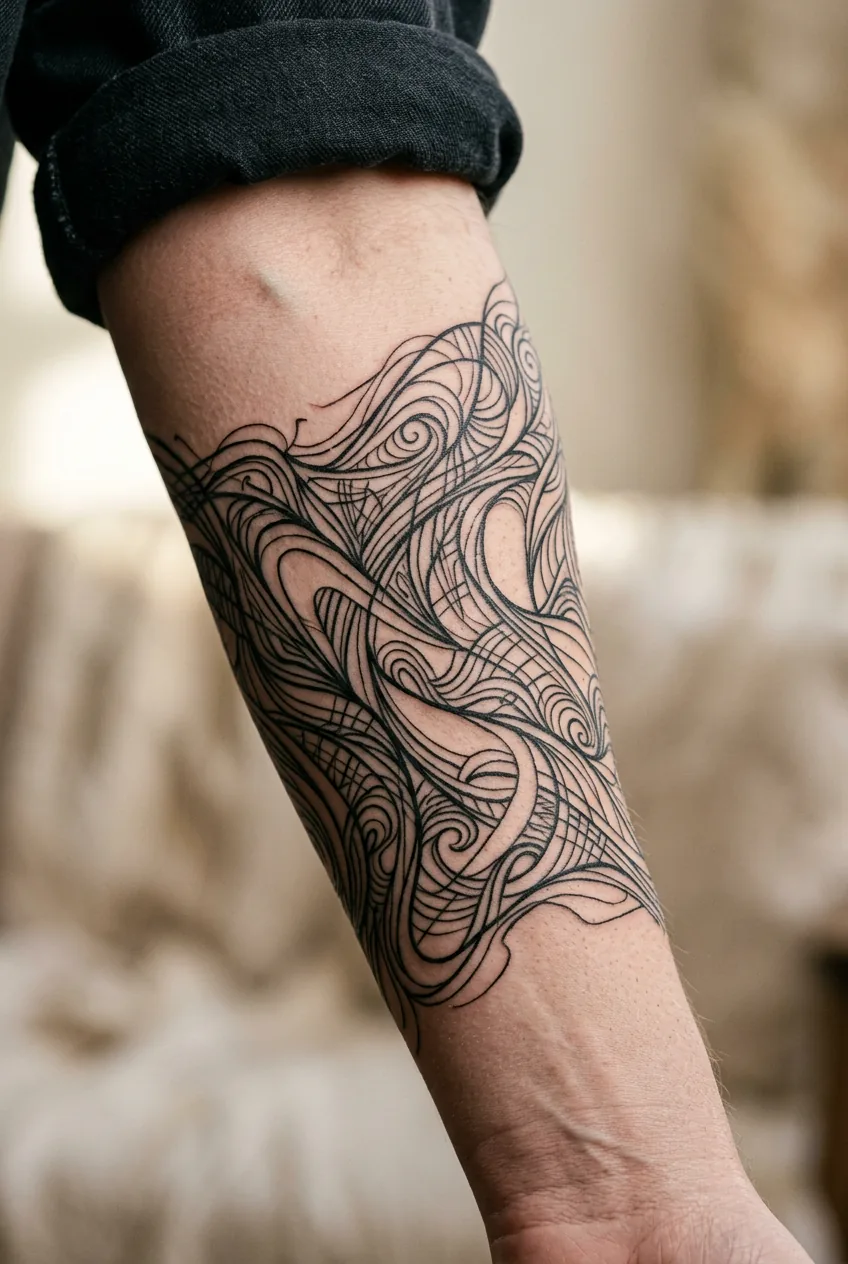
Look at the detail in her piece here — the way the abstract linework reads from multiple orientations because of where it sits. You catch it differently depending on whether her arm is extended or bent. abstract forearm placement considerations matter more with non-representational work than with figurative pieces, because abstract designs don’t have a clear “right way up” — which is actually a feature, not a bug.
The “too visible” concern is worth addressing directly: we are in 2026. Visible tattoos on women are not the professional liability they once were. If your workplace still penalises forearm tattoos, that is a workplace problem, not a tattoo problem. And I say that as someone who navigated exactly that conversation once and came out the other side with no regrets whatsoever.
Quick Answers About Abstract Tattoos
Do abstract tattoos age worse than other styles?
Not inherently — but some techniques within the abstract world do require more maintenance. Watercolor washes without dark anchors tend to fade faster, while bold blackwork abstract pieces age extremely well. The key is choosing an artist who understands how their chosen technique behaves under the skin over time, not just how it photographs fresh.
How do I explain what I want to a tattoo artist if I can’t describe an abstract design?
Bring references for feeling and mood rather than trying to describe specific shapes. Images of abstract painting, fabric patterns, or architecture can communicate aesthetic direction even when you can’t name the exact lines you want. A good artist who works in abstract styles will take that emotional reference and translate it into something wearable. Trust the conversation.
Is abstract tattoo work more expensive than traditional styles?
It varies wildly by artist. Some abstract specialists charge premium rates because their work is genuinely custom and technically demanding. But abstract flash — which I fully advocate for — can be very affordable. The price is tied to the artist’s rate, not really the style category itself.
Can abstract designs work alongside floral or figurative tattoos in a collection?
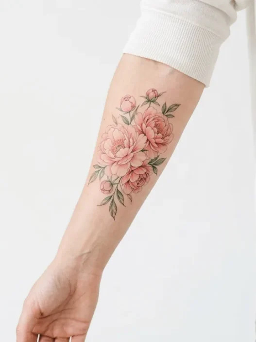
Absolutely, and this combination is one of my favourites. Abstract forms can act as connective tissue between figurative pieces — filling negative space or framing a floral tattoo with linework that doesn’t compete for attention. The contrast of representational and non-representational work in the same collection creates a visual tension that reads as deeply intentional and personal.
The through-line in everything I’ve defended here is simple: don’t let the trend cycle make decisions that will live on your body for decades. An abstract tattoo that someone on Reddit called “so 2019” is still going to be on your skin in 2036. What matters is whether it moves you, whether the artist is exceptional, and whether the decision feels like yours. Everything else is noise — and honestly, pretty boring noise at that.